Brian Crick

About a Sharp Dressed Man

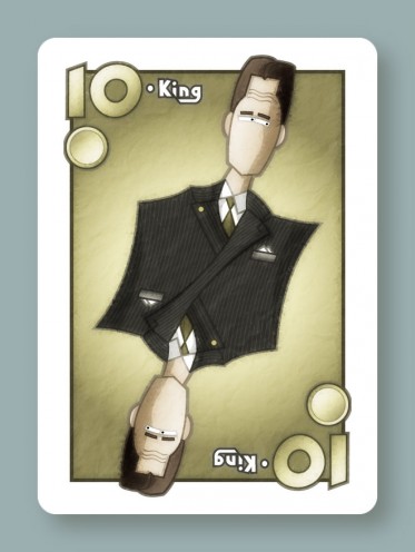
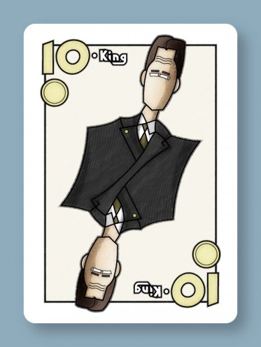
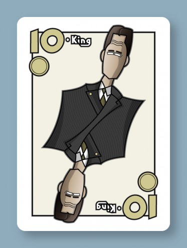
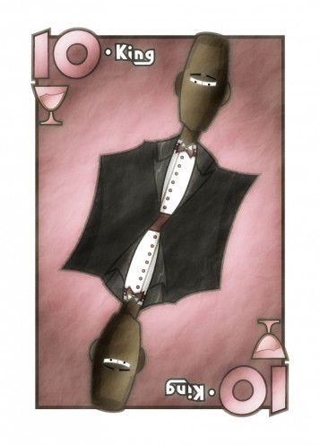
Finished my King of Cups.

I tried a white tux, but the large swatch of white just didn’t work… it felt empty. So I just made it black like the businessman.

I feel a little weird about how not-detailed the sides of the tux are, but in some ways I like it.

Don’t have too much else to say about this, except that copy/paste is definitely not the way to go here. While there’s a similar end result here to the businessman, the underlying shapes used to create that result ended up being very different. Would have been faster to simply start from scratch.

Abstraction

Have the beginning of a King of Cups.
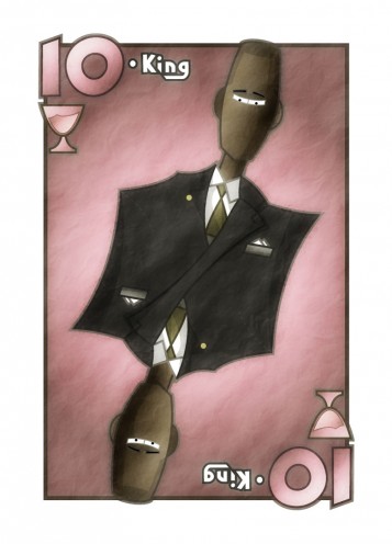
As you can surely tell, I started with the King of Coins and made modifications from there. I still need to change the suit, to make it a white tuxedo instead of a black business suit.

I’m not sure if this copying-and-pasting approach is actually faster than starting from scratch. I’ve spent 45 minutes on this so far, which is already quite a bit longer than the 15-30 minutes per face card I was hoping for. Of course, I really have no idea what sorts of expectations to set here, so I’m not going to beat myself up too much about the time spent… this is, after all, a learning process.

I didn’t really sit down and design the cup icon; I just drew something straight in Illustrator really quickly. But I rather like what I ended up with. I think I’ll keep it, with only slight modifications probably.

* * *

While I’m waiting on answers to some questions I had for the client, I thought I’d post some ruminations on what I want to get out of this. And what I want is to do work for precisely the sort of games I don’t like playing.

I like games that are about building stories. Games with memorable characters and places, where after the game, you find yourself joking about the funny or surprising or hero-clobbering plot twists that came up during the game.

These sorts of games tend to have lush, naturalistic illustrations where every picture could be a still from a movie.

I have neither the skills nor the desire to produce this kind of stuff. I like making illustrations that are a little abstract. The sort of illustrations that would be well suited for more abstract games, where your characters aren’t characters so much as ideas represented by people.

My stuff tends to lean towards Art Deco, so this is no real surprise. If you’ve got, say, an Art Deco mural with a bunch of construction workers… those workers aren’t people. They’re the visual manifestation of the idea of hard labor, and the nobility thereof. They’re archetypes. If you’ve got an abstract strategy game where you can summon any number of identical snipers each turn, those snipers aren’t individuals. They’re sort of platonically ideal snipers, and I like it best, from a visual standpoint, when the character portraits for these more abstract games have more abstract art for these kinds of things.

I’d love to have done art for games like Pandemic… there are people, but not really interesting characters you can connect to. I would have loved to have seen some stylized, glorified doctors and engineers in that. That would have been pretty awesome.

Of course, when my board game project gets further along, I’ll want to do more naturalistic illustrations for that since it’s supposed to be story based. Should be an interesting challenge.
Scopa King, Final (No, Really.)

With the random stuff I work on, usually it feels like it goes on forever. But sometimes, there’s a fine line between done and not-done.

This here Scopa King is done. This is the look I wanted. Nothing more, nothing less.

The last thing I did was add that radial gradient behind the character, and that finished off the illustration for me. I could repeatedly hit undo/redo in Photoshop to toggle between states and go yeah, this current version is done. This version one step back in the undo history is not done. It’s a really fine line sometimes.

I guess it’s all about setting expectations that are both precise and reasonable, which I tried hard to do here. This took a little longer than I wanted, but it was never my intent to make my best illustration ever — just to do something with a reasonable level of quality, in a reasonable amount of time. And mostly, I think I got that.

Of course, the big question now is, how long will it take me to do the other cards? There are 11 more to do, plus some simpler, more abstract numeric cards that will largely be copy/paste jobs.

Getting to this point took around 3 or 4 hours, but I’m hoping for 15-30 minutes per new face card. Luckily, I’ve got things set up in Photoshop in such a way that I can just import my Illustrator art and all the weathering will happen completely automatically.

So hopefully, I’ll have an update on that later this week.

Scopa King, Nearly Final

Have a Scopa update.

This is just about done, though John suggested adding a pocket with a handkerchief and some buttons, which sounds great to me.

Mostly, I focused on coloring and texturing.

The shadows and shading were all done by hand using extra vector art in Illustrator, something I’ve never done before. I usually try to use gradient meshes or drop shadows or Illustrator’s 3d tools for that sort of thing. But now that I’ve tried this, I love it — as a bit of a control freak, I like having absolute control over the shapes of the highlights and shadows.

Once I had the coloring done, the image looked like this:

Kinda cartoony, kinda flat. I think, for this sort of look to work, you have to make it look a little distressed… more like an old poster printed on idiosyncratic equipment and less like cheap vector clipart.

This is actually a look I’ve been trying to get on my stuff for years, and I think this is the closest I’ve ever come to it. If you’re curious, what I did was this:

  • Import my Illustrator art into Photoshop.
  • Duplicate the one layer you’ve got.
  • Apply a gaussian blur to the duplicate (I did 6 pixels here I think.)
  • Apply a normal diffuse filter to the duplicate 10 or so times in a row.
  • Set the blending mode of the duplicate to 100% overlay.
  • Add a new layer.
  • Make some black & white clouds on the new layer.
  • Add a few difference clouds to that. I did like 6 iterations.
  • Emboss.
  • Set the blending mode of the clouds layer to 100% soft light.

So that gave me some wrinkles and the impression of imperfect printing. I’ll probably futz with it a little more and add some scratches too.

Copyright © 2017 Brian Crick.