Brian Crick

Postmortem : Celestial Stick People

As always happens with postmortems for projects with no set deadlines, it feels good to write that subject line. So on to the dissecting.

making it up as you go

It’s not like I sat down twelve years ago and said hey, I’m gonna try to draw and sell a full 78 card Tarot deck. So I can’t really evaluate this in terms of how well my final product matches my intent. However, I’ve definitely learned the importance of good planning, as there was no real planning for this product. There was an awful lot of backtracking here. Some things I should have done better:

  • If there’s any possibility that what I’m doing will make it into print, I should make sure my Illustrator files have print-quality raster effects. Changing the effects resolution after the artwork is mostly finalized is a huge pain.
  • Keep separate images in separate files. While it’s convenient to have everything in one place, Illustrator crashes frequently on my large, multipurpose files.
  • Keep files organized. Which is to say, I totally didn’t do that here… just finding the files I needed for any given task became rather difficult late in this process.

those jargon-free rules

Looking over my rulebook, everything feels reasonably straightforward. Unfortunately, I never really had a Tarot newbie try reading the rules and tell me if they made sense. Really should have done that.

In terms of layout, I’m not thrilled with the layout of the instructions, but given the constraints I was under (limited to three separate, unordered sheets of paper) I think it’s adequate. Not good, but adequate. Again, lots of backtracking here as I figured out what format I would need.

the ilustrations

I really can’t think of any changes I’d want to make to the illustrations, looking over them again. Maybe the backgrounds could be better, more textured. But my only real complaint is that, because I changed the contrast fairly late in the process, you can see some slight banding on the background.

(Okay, I can see slight banding. Most people probably won’t notice.)

Anyway, I do need to learn how to do color management better so I’m not changing contrast in Photoshop at the last minute.

web site

Because of some errors I made in my scripts, the web site for the product was effectively down for a few days shortly after launch. Whoops.

I made the site years ago, and barely changed it for the product launch. I briefly considered moving it to WordPress like my personal site, and in hindsight, I probably should have done that. I just don’t think it’s worth my time trying to maintain custom scripts for a web site; most of this stuff is pretty cookie cutter, and the nice thing about a third-party CMS is, a lot of people have tested it for you. It’s all standardized, and easy to get help on.

dead ends

So for a long while, I was considering getting this printed through a local professional printing press. The minimum order would have been like 100 or 200 decks, with an upfront cost of two or three grand.

While everyone I talked to at the printer was friendly and helpful, I’m really, really glad I didn’t go that route. Did you know that playing cards aren’t just colored pieces of card stock? They’re coated in plastic, and have this thin layer of graphite in the middle that gives them a lot of springiness.

I didn’t realize this until I’d shrugged off professional printing as an option and bought my own paper cutting machine and nice color printer with which to do everything myself. And I got some nice cardstock and printed out cards… and they didn’t feel like playing cards. At all. They didn’t slide against each other right, and they didn’t bend right. And while your typical Tarot cards and board game cards don’t feel nearly as nice as nice playing cards, you can still shuffle them and slide them against each other, which isn’t a guarantee at all with any random card stock.

I would have been terribly disappointed if I’d only realized this after dropped a few thousand dollars on printing a hundred of these things. So while I didn’t end up using my own equipment for this, having it and trying it out taught me a lot about printing.

So I’m happy I went with The Game Crafter, with their nonexistent upfront costs and suitable-for-games card printing. There’s no telling how cranky I would have gotten collating and packing all those boxes myself, and I’m glad I didn’t have to set up a storefront. Again, this is pretty cookie cutter web site stuff and I’d just as soon have someone else do it.

to sum up

I’m sorta surprised I got this out at all, considering how long it’s been in development. But overall, it was a good learning experience, and I’m super excited about printing an actual board game through The Game Crafter now. And making a card-reference tablet app in Unity or something.

And trying to get this in real stores. In many ways, this project is just beginning.
 

Celestial Stick People is Done!

For all you non-Facebook, non Google+ friends, Celestial Stick People is done! Like for real. You can even, like buy it and stuff if you really want.

Got the final prototype last night and rushed through getting photos and flipping switches on web sites as quick as I could, lest I bail. You’d think there would be less of an urge to rush, given that this project is over a decade old… but yeah, not so much.

Postmortem coming soon.

Postmortem : Girl Wonder

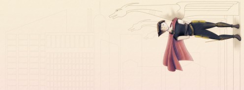
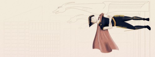
So here’s my submission to the Girl Wonder banner contest (click to enlarge):

And just to get the good stuff out there first, have a new revision:

This was made after the contest deadline, but I was kinda fried on Sunday and thought I’d try to clean this up a bit, just to do it.

Rather than a what went right / what went wrong sort of thing, I thought I’d break this up into smaller chunks by subject. So here goes…

motivation

It’s amazing what an external deadline can do. I’ve wanted for quite some time to work on my people drawing skills, and this contest was a great excuse to do that. Also, Marie and I have been talking about doing a superhero comic together, and this was a good way to dive in and see if I was really capable of doing comic-appropriate art to my satisfaction. (I’m pleased to report that I’ve decided that the answer is yes, which I wasn’t certain of at all going in.)

You could say the timing could have been better — also had a big work deadline coming up — but ultimately, I think that having a single, isolated project to work on during such a deadline helped me focus during regular work.

anatomy

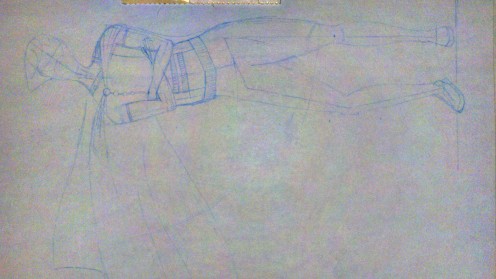
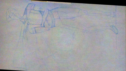
Overall, I think the character’s body came out pretty natural and realistic looking. Mostly I  credit careful planning — figuring out the character’s proportions in advance with a simple stick model that I then drew over.

But as you may recall, when last I posted about that, I had a decent looking sketch with a not-so-well-proportioned upper body.

The next time I was able to work on this, I was away from home, and unable to transfer any changes to my sketch into the computer. So I just went straight into Photoshop and enlarged the arms and shoulders a bit, which nicely fixed the long torso problem.

(Yes, I used Photoshop to try to make a figure’s proportion’s more realistic. 🙂 )

I mentioned I might do this, and while it was kind of cool and necessary to be able to do this while away from home, I’m thinking now that it’s not really a great solution. My first priority should be learning to detect problems before I’ve started drawing over them. If a problem does slip through, generally speaking, it would probably be best to adjust the sketch directly, so I get good at doing this right on paper.

layers, layers, layers

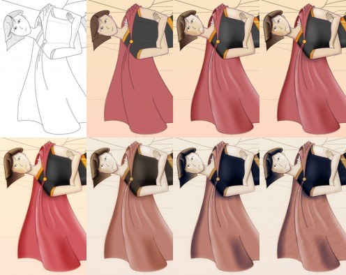
I made extensive use of Photoshop and Illustrator’s nondestructive filters and layers. I’m not sure I can explain in well here, but basically what that means is that things like colors, shading and special effects can all be handled independently.

So in the image below, you can see each of those things getting added, one by one, to a simple black & white outline.

Despite its complexity, this worked out pretty well. I could quickly go back to any layer in my documents and make changes that would propagate forwards to the final product automatically. So, for instance, if I decided I didn’t like the color of the cape, I could change just my color layer and the shading and shadows would be preserved.

shading

So like 14 or so years ago I was trying to do coloring for an online comic (that sadly never got off the ground), and I was trying to do it in Photoshop, using its drawing tools. It didn’t turn out very well; everything was kind of muddy. There were highlights and there were shadows, but my shading didn’t really clue you in to the precise shapes of things at all. Sure, my skills weren’t very good, but that distinctive Photoshop brush muddiness is something I’ve seen even in professionally produced comics.

For this contest, I wanted to make sure my shading was crisp and detailed, so you got a sense of cheekbones and wrinkles in the cape, things that aren’t being expressed with linework.

Illustrator has this thing called gradient meshes, which I figured would work well here. The third image on the top row of the image above introduces some gradient meshes I used for shading, most notably on the cape. Again, I don’t want to go into too much technical detail, but while I got the crispness I wanted, all those meshes were a pain to work with.

Next time I do this, I guess I basically have to options: I can learn to work more efficiently with gradient meshes, or I can revisit my homemade paint program, which contains what’s supposed to be a simple system for doing this kind of work, but which needs some fine tuning before it’s really usable. Neither of those options sounds immensely attractive.

drapery

The cape makes no sense. It isn’t just unrealistic or poorly executed; the geometry of it is simply impossible.

I only realized this the morning after I turned in my submission.

I think my big hangup there was that I was trying too hard to figure out what this thing would like like, when I should have been thinking about how it behaved.

For my revision, I tried to think of the cape as a bunch of strings. Like a beaded curtain. I imagined that the curtain was anchored on the character’s back and shoulders, and I imagined individual strings draping over and hanging off of different points on the character. It was easy to figure out where each string would fall. And then, you can kind of mentally stitch these one-dimensional strings together and figure out how this two-dimensional piece of cloth is going to look in three dimensions.

I don’t know if that’s the best approach, but it was good to figure out some sort of manageable approach, if only after the contest deadline.

triage

The reason the background isn’t colored in is that I realized I wasn’t going to have time to do everything I wanted, and rather than have a whole image half complete, I thought I’d submit something with a good looking character and a sketched in environment. Getting the character right is what I needed the most work on.

Similarly, I totally punted on the costume; again, while I’d find it an interesting challenge to come up with something theatrical and tasteful, it just wasn’t a priority.

That’s not totally a bad thing. There’s something kind of appealing about the utilitarian jumpsuit look.

looking ahead

Marie and I have been talking for a while about this superhero comic thing, and I’m really excited about it now. There’s still a lot of workflow issues I need to sort out if I were to do that many illustrations, but this experience has convinced me that it’s at least possible.


Copyright © 2017 Brian Crick.