Brian Crick

Twelve Not So Angry People


Finished up outlines for my speakeasy board game characters last night.

characters-21-december-2012-1 characters-21-december-2012-2 characters-21-december-2012-3


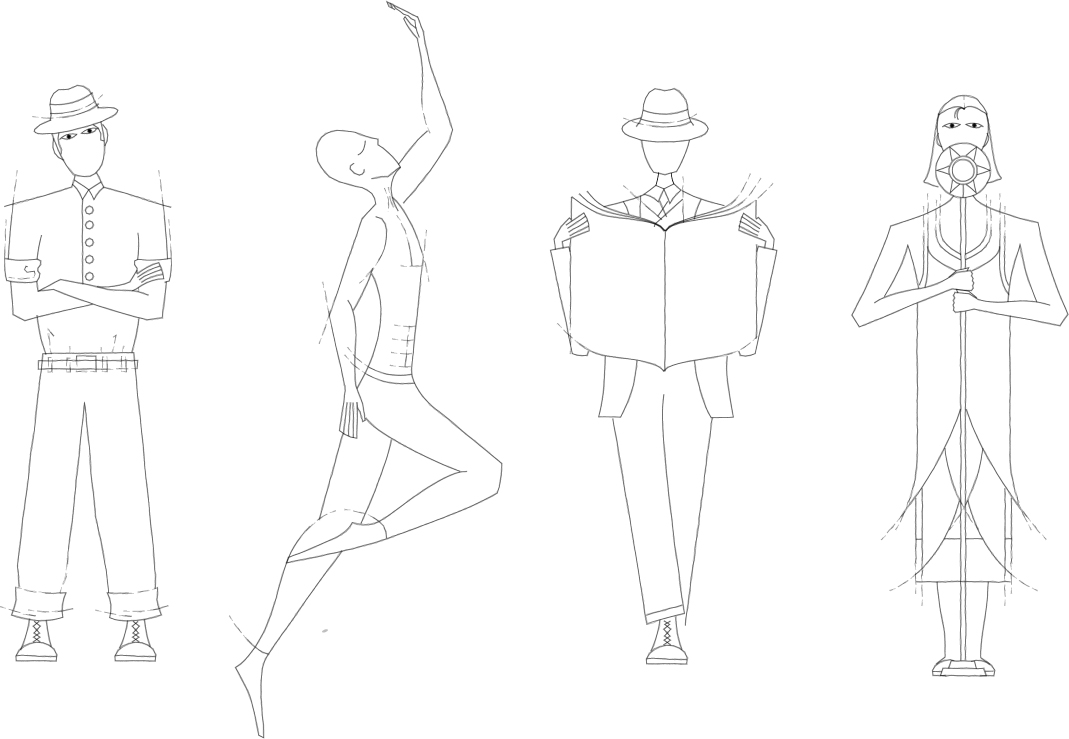
Working as fast as I possibly could, I’d say each outline took 15 minutes. Working at a more leisurely pace (as I did last night) I’d put each outline at around 25.

You’d think it would take less time than that.

But anyway, have some random notes:

one game a month

So there’s this One Game a Month challenge coming up. And it occurs to me that I’ve already got four things in the pipeline — two board games, two computer games. I was already hoping to get most of those things done sometime in 2013. So, I figure, this speakeasy thing and the three other things in development — Tinselfly, a cyberpunky boardgame (big, big breakthrough last night!) and Operetta can get lumped in there. Ok, well, who knows what decade Tinselfly is coming out… but let’s not give up hope. A lot could happen between now and the very last month of One Game a Month.

But more on that whole endeavor later.
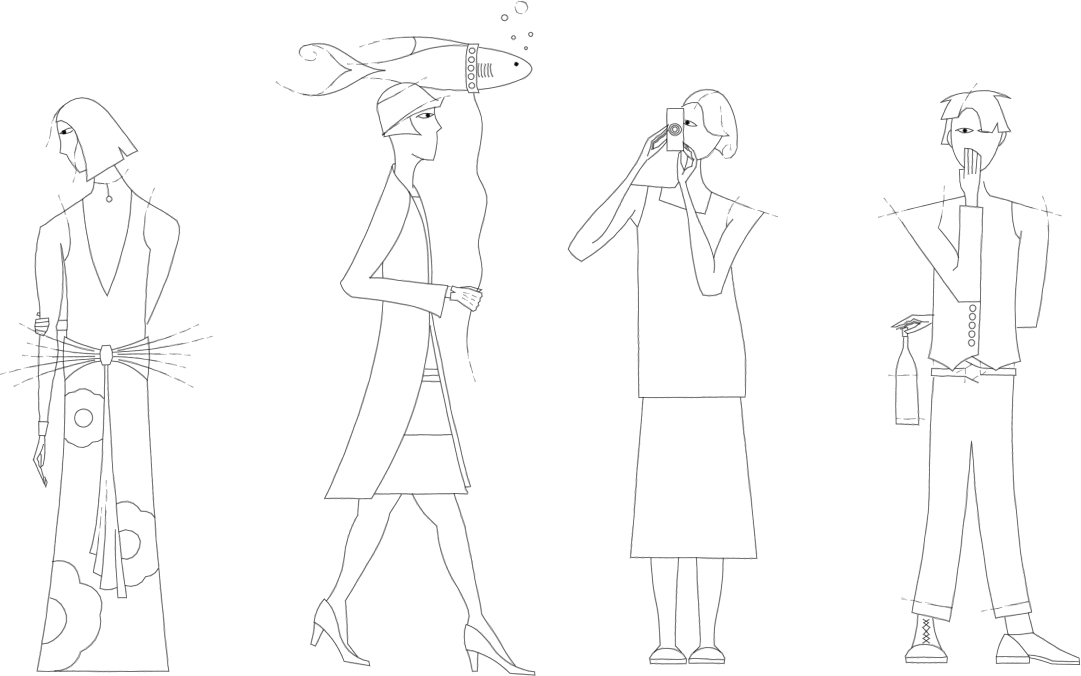
heels

OMG high heels are awkward.

I’ve never drawn a person wearing those before, but much to my surprise, it seems that most women in my 1920s fashion books are wearing high heeled shoes. So I figured I had to have at least one character in heels.

I couldn’t draw the feet on that character on the bottom, walking her fish, without thinking about how strange the position of the feet were and how uncomfortable that looked.

I’m glad that I’ve decided that, in the Tinselfly universe, everyone wears flats.
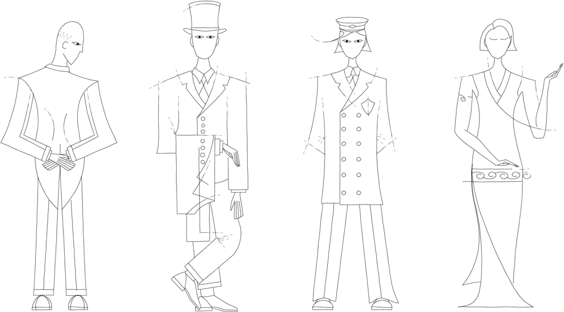
back view

The character on the lower left is supposed to be facing away from you. I’m not sure that’s entirely clear, or how to make that more clear.

Maybe, when there’s color, I can have some shading indicating that that’s the small of her back you’re seeing, through a relatively tame dress with a low back (again, based on real period stuff I saw).

hard edges

Here and there, I tried to make things a little too geometric to give things this art deco look.

I think I could have done more of that, but I was kind of rushing to get these done.

Stupid Photoshop Tricks: Corrosion

Recently, I made a logo for someone’s upcoming RPG.

logo-opaque-13-december

They wanted something kind of corroded looking; if you view the image full size, you can see how the letters look a bit icky and old.

8-even-more-pits

So I wanted to talk a little bit about how I did that. It’s mostly Photoshop tricks and very little hand-drawing.

First, I started with some boring grey letters in their own layer.

1-outline

Then I added a stock bevel and drop shadow — just standard Photoshop effects. You can click on the fx bottom on the layers palette to add these.

2-basic-effects 

I made a generic sort of streaky rusty copper texture like this:

a-copper-texture

It may look complicated, but it’s mostly stock filters.

c-copper-steps

On the image above, you can see the results of a Filter->Render->Clouds on top. In the middle, I’ve done Filter->Stylize->Find Edges. And on the bottom, I’ve done a Filter->Stylize->Emboss. And with that, you’re most of the way there.

So I made this great big copper texture and pasted in into my document, and used a clipping mask to make it look like a texture on my beveled letter. You can do that by selecting the texture layer and going to the little arrow menu on the Layers palette and selecting Create Clipping Mask, and what that does is, it uses the opacity of the layer under the selected layer as the opacity of the selected layer itself. But the effects, like the bevel, are still visible.

3-pattern

So at this point there’s a nice color texture, but it needs to look kinda bumpy and worn.

Sadly, I forget how I made this one. 🙁

b-pit-texture

But it was also pasted into my document, and had Clipping Mask turned on, and I set the Blending Mode on the Layers palette to Hard Light. That makes it so that the colors of the layer underneath are preserved, but you’re sort of adding shading to it. So you can see below how the letter’s still blue-green, but the highlights and shadows in the pitted texture above are coming through.

4-basic-pits

There’s this sorta lumpy, pitted texture now, but the edges of the letter are still perfectly smooth — it doesn’t look quite right. So I took little bites out of the letter with the Eraser tool, just near the edges, to make it look more like this texture was a three-dimensional thing. This effect is most visible where all the strokes come together in the middle of the letter.

5-more-pits

Next, I wanted to add some mineral deposits. Rather than make a custom pattern, I just used this yellowy, lumpy rock pattern that comes with Photoshop.

d-mineral

What I did was, I made a new, empty layer and added a Pattern Fill using that fx menu, and a Color Fill too, to tone down the yellowness a little. And then I just started drawing blobs over my letter.

Part of the goal here was also to hide the flat appearance of the bottom-right part of the K; sometimes, Photoshop’s automatic bevels look a little funny.

6-minerals

That ended up being a little hard to see,and not nearly nasty-looking enough, so I also added a bevel to the mineral layer itself. So it kinda looks like there’s this buildup on the letter.

7-minerals-emboss

And finally, I added some more pits, again near the intersection of all the strokes for the letter.

This is a little strange. What you’re seeing below is some beveled dots, but the dots themselves aren’t visible — you can do that by lowering the Fill on your layer in the Layers palette. And what you’ve got then, is the bevel effect applied to the layers underneath the dots.

8-even-more-pits

And there you have it… a lovingly crafted, nasty looking K. 🙂


Fun with Insanity

So I was explaining the weird history of my Tinselfly mechanics to someone at last night’s game developers get-together, and something just sorta clicked.

I’ve been hesitant to start level design, even though everything’s finally in place for me to do so, in part because I’m unsure about the fitness of my core mechanics in this project. My rationale goes something like this:

  • My current mechanic was designed from beginning to end to be a fun combat system.
  • Tinselfly will include very little combat.
  • Therefore, I should pick should a mechanic more appropriate for Tinselfly and use my combat mechanic in a game set in a universe with random combat encounters or something. Both Tinselfly and said combat-based game would be more fun because I did this.

However, I think this is a logical fallacy. The mechanics suitability for a combat-based game does not necessarily make it unsuitable for Tinselfly.

Instead, I could be thinking this way:

  • My current mechanic was designed from beginning to end to be a fun combat system.
  • Compared to combat-based games, non-violent games can often be lacking in that hard-to-describe fun factor.
  • Therefore, I should adapt my mechanic to Tinselfly, since I’m already confident it’s will be fun, and I because non-violent games deserve that same fun factor too.


The story for Tinselfly is pretty bleak in parts. And while there are certainly games out there — great games — that you feel compelled to play even though they’re not what you’d call ‘fun’ at all times, I don’t ever want the players of this game to see the moment-to-moment gameplay as a drag.

* * *

Part of the problem with adapting this mechanic is the inherent absurdity in many combat-based games, absurdities that have to be there to make the game sustainable.

Take dungeon crawls. Where did all those monsters come from? More to the point, why do the keep coming back after you slaughter them by the hundreds? What do they eat? Why does everyone’s discarded armor fit you, regardless of species or body type?

If I’m going to have constant, fun challenges for the player, I might do well to think a little less about where those challenges are coming from. There should be an inexplicably inexhaustible supply of people to help. An absurdly dangerous trek to the grocery store. Bureaucracies that are puzzle-like, not just in terms of paperwork, but in the layouts of civic buildings.

The Tinselfly universe, the version sitting in my head, is very real to me. It is nuanced and detailed and believable.

That could be a problem.

I can’t just gamify the player’s path through a naturalistic universe or the player’s perception of a naturalistic universe.

I have to gamify the universe itself.

Jam is a Sometimes Food

So there was another game jam this weekend, and I didn’t participate this time around. And there’s a jam coming up in January, and I’m not sure I’m going to go.

It’s not that I don’t enjoy game jams; they’re fun and intense and I learn things I’m not expecting to learn, which is the best kind of learning… but it’s a little like, I dunno, binging on chocolate. Sure, I love chocolate, but if you really love chocolate, you won’t allow yourself to be in a situation where you’ve eaten so much of it that you kind of want to throw up and never see chocolate again.

You know, like there’s a PSA in my head saying PLEASE EAT CHOCOLATE RESPONSIBLY.

Anyway. I guess I’m just not real into the jam kind of environment where you’re plugging away at one thing, to the exclusion of all else.  I’d much rather, ya know, spend any given weekend with Marie or friends or whatever, and do game dev stuff when I’m home alone.

However, there’s this other thing coming up called One Game a Month, and that sounds more to my liking. I could work at my own pace, on my own terms, without having to block off a whole weekend.

* * *

You need a Twitter account to sign up for One Game a Month. I had one for a while, but kinda hated the whole Twitter experience — I think it’s fair to say I just didn’t ‘get’ it — so I killed my account entirely.

But I went ahead and signed up again. Guess it’s worth another shot.

The Faintest Ink

A while ago, Marie told me an old proverb: the faintest ink is better than the best memory.

I’m usually not much for proverbs. Most quotes that stick with me are from mediocre movies. But this one really stuck with me, and I’ve trying to integrate this thought into my life more, whether it’s taking notes at meetings or making maps of video games.

With that in mind, I’ve started a little wiki of sorts for Tinselfly (massive spoilers will eventually make their way there, if anyone cares). I’ve still got a long way to go, but the idea is to write down every decision I’ve made about the characters and story and whatnot, because there’s really a lot just sitting in my head that’s never been written down, anywhere.

I probably have more discarded, forgotten ideas related to this project than I could possibly write down. And while it’s important to cut and change things, I would like a record of what’s been changed and why. Might be good to have.

* * *

One of my biggest concerns with anything project like this is being precious about it. While this project is, of course, important to me, I don’t ever want to find myself in a situation where I’m so enamored of a particular idea that I’m unwilling to step back and evaluate its fitness for inclusion in my final product.

You’d think that getting all this stuff out of my head and into a more permanent, public location would cement these ideas in my head, and it would become harder to fight that preciousness, but the reverse has happened. Seeing these ideas written down, and re-reading them helps me with that evaluation process.

Like my approach to my journal in general, sometimes you have to write something down so you can realize how stupid it is. It’s so much easier to be precious about an idea when you haven’t actually had to explain it to anybody.

VHS

So it was around 2000 or so, and Marie and I were living in our second apartment, and our VCR was either dead or dying. And I remember thinking to myself, this is it. This is our last VCR.

It was kind of an odd thought. Not sad or exciting; just odd. I’m not sure I could say I’d bought my last anything before that. But it made sense. Our next VCR wouldn’t be a VCR; it would be a DVD player.

Technologies come and go. Historically I’ve kind of blasé about it. But lately I’ve been thinking about this stuff a lot.

* * *

I’ve been without a pen tablet for about a year now. You’d think I would have rushed out and bought a new one as soon as my latest one failed, but for some reason I didn’t. All the Scopa cards I’ve been posting, the Girl Wonder submission, those were all done with a mouse.

Maybe the pen tablet will be replaced with a tablet computer, maybe not. Drawing directly on screen would be awesome, but I can’t say I’ve really warmed up to tablets yet.

* * *

I haven’t updated my Adobe products in four years. Photoshop,Illustrator, Flash — I’m several versions out of date now.

I may never buy another Photoshop or Illustrator.

Ever.

This thought kind of scares me. I’ve been using Photoshop since around 1992. I’ve invested a lot of energy into learning to use these programs as efficiently as possible, and would probably take a pretty big productivity hit if I switched products. I can open things I haven’t touched in a decade and start working on them without missing a beat.

But I don’t do freelancing anymore, and Adobe’s flagship products are expensive. There’s also a lot I don’t like about these products, not that I’ve tried anything else lately.

* * *

This wouldn’t be that much of an issue, except that from what I’ve read, my versions of Adobe’s products won’t run on the newest version of Windows. When my current laptop dies — and from the looks of things, that’s going to be pretty soon — I’m going to have a bit of a problem.

My strategy right now is to continue working on my own illustration program, and just keep my development tools up to date, which is relatively inexpensive.

We’ll see how sick I get of development after a while I guess. 🙂

Parallel Processing

Got outlines for a couple new Scopa cards.

These two characters are going dramatically faster than my previous ones. I’m changing my process a little, and that’s helped.

Here’s what’s different about the process, compared to when I started this project:

  • The outlines are monochrome. While my final product will have multi-colored outlines, not having to decide upon and change colors while drawing allows me to just draw line after line, really quickly. The whole process will end up being draw lines -> color inside the lines -> change line colors based on chosen fill colors. It seems kind of counter-intuitive, to change the colors of your outlines as the last step in your process, but I’m certain that doing that after I’ve decided on the fills will result in less indecisiveness and repetitive tweaking of the outline colors.
  • There are no fills yet. Again, this lets me just draw lines in rapid succession, and later I’ll draw lots of fills in rapid succession.
  • I’m doing two characters at once. If I’m already in outline-tracing or color-filling mode, I can quickly jump into doing the same task on another character, quicker than I could switch to a different task on the same character. You hit kind of a no-mind groove when sticking with a single tool in Illustrator.

So there you have it. All it basically comes down to is batching my work, and doing similar tasks all at once.

Myssing Links

Yesterday, for no particular reason, I started playing Myst again. My one video game of choice lately (La Mulana) causes my computer to randomly shut down without warning, I had a hankering for a video game to play, and I wanted to reacquaint myself with adventure game tropes (and to that end, I’ve also started Syberia II).

So since I was thinking about Myst, I went looking to see what one of the developers, Robyn Miller was up to.

And I was reminded that he has a web site named Tinselman.

* * *

My stupidly-long-in-development game project Tinselfly is the combination of two different things I was working on a couple years ago.

The name Tinselfly and the game mechanics come from a fairy-tale-themed follow-up I was doing to a game I made for a contest put on every year by Jennifer Ann’s Group. There was a damsel in not-so-much distress, and flying insects that emitted razor-wire-like strings from their bodies, like spiders emit spiderwebs. Hence the name Tinselfly; an earlier potential title was Damselfly.

The other project was Basil Street Bridge, an outer-space adventure starring a girl named Robin, who may have been consciously named after Robyn Miller.

Mash these two projects together, and you get an outer-space adventure named Tinselfly with a lead named Robin.

* * *

Am I getting into creepy copycatting territory here? Probably not.

Is this just a massive coincidence? Probably not that, either.

When an idea ‘just pops’ into my head, I like to trace it to its source. To the extent that I’m going to put a lot of effort into tracking this stuff down, I’m more likely than others to look at my work and find it depressingly derivative.

When I first played Myst, I really wanted to be the next Robyn Miller when I grew up. Which would make my brother Rand Miller, the other lead developer of Myst. I thought, in my own naive highschooler way, we might be the next Millers and make the next Myst or something. You know, and do a Gap ad.

The Robin character in Tinselfly is sort of an exaggerated version of myself. Her homeworld is based on my home town.

So in its own way, there’s this weird convoluted logic behind why Robin is named Robin, since I’ll conflate Robin and Robyn and myself.

* * *

I’ll probably stick with the name Robin and the title Tinselfly, but it’s something to think about I guess.

Copyright © 2017 Brian Crick.