Brian Crick

Catch ’em All

I love sets of things. On some level, perhaps we all do.

When I was growing up, my family had those Time-Life book collections. 23 books talking about the history of flight. 20 books about different countries of the world. 20 volumes on astronomy. Every now and then, we would get a new book in one of these sets in the mail, and excitedly add the book to its collection. I remember scouring flea markets many weekends with my dad, trying to find the last few records in some Time-Life music collection we’d gotten used. Our set was incomplete.

This could not stand.

Sets are fun. Sometimes, it’s infuriatingly difficult to know when you’re done with something. You wonder if you’re definition of complete isn’t complete enough. You want to add one more thing. You worry that there might be something out there you need, something that you don’t know you don’t know exists. But with well-defined sets… you know what you’re missing. You know what to look for. Most importantly, you know when you’re done. And it’s just such a satisfying feeling to know that, finally, something of yours is complete. Finished. And you can move on with your life.

I have started thinking about game developments in terms of set collection.

* * *

My still-in-development Global Game Jam game is all about finding new ways to traverse a world that doesn’t make walking from place to place very easy. So my first job, as I saw it, was to design a complete set of power-ups that let you move in new ways. I will know if my set is complete if you ways ways to:

Move, laterally, farther than normal, across chasms.

Jump up higher than normal.

Fall down greater distances without dying.

Move through things you couldn’t move through before.

Walk on things that were once hazardous to touch.

Skirt around and below things that were once dangerous to approach.

In very general terms — if you think in terms of what axes you can move on and where hazards are in relation to you — there are a finite number of ways one can move around one’s environment. I will know I have a workable, complete set of player upgrades if my upgrades cover all of these movement cases. And once I have those upgrades designed, I will be able to move on — because at that point, I will be done. And while I may tweak my upgrades throughout the development of this game, I will feel confident knowing that the vast majority of my conceptual work is done. I finished my set.

* * *

My wife recently alerted me to a simple approach to figuring out what scenes you need in your story:

Write down every major character, setting and concept in your story, in a big circle:

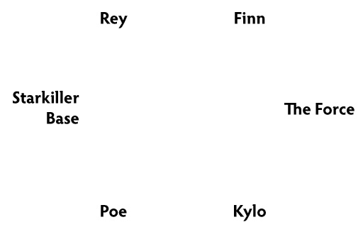
Then connect all of them.

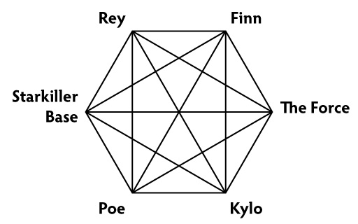
Every one of those lines is a possible scene.

Write a scene developing Rey and Kylo’s relationship.

Write something exploring what Finn thinks about this whole Force thing.

Write a scene showing how Poe and Finn meet.

Write scenes with each of the characters doing something interesting in or around Starkiller Base.

Once you have scenes for each of those lines, each of those relationships, you have a good start of a story. You have a complete set.

* * *

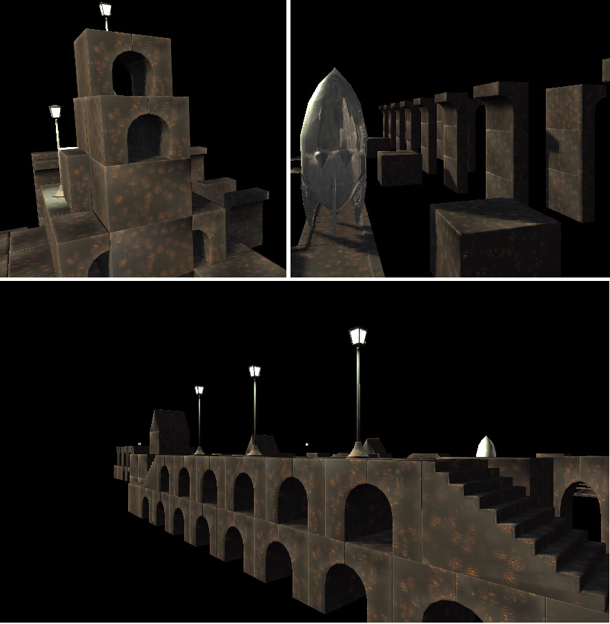
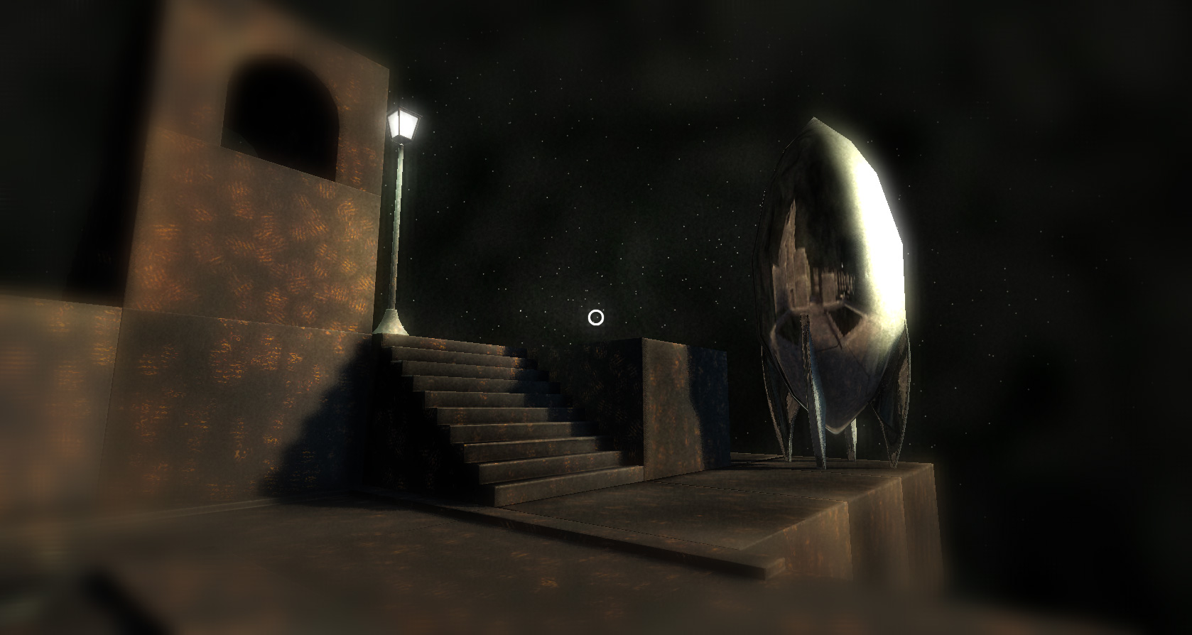
I am working on a board game where you wander around a fantasy world exploring fun and interesting locations. I’ve been having the hardest time figuring out what those locations should be. So I forced myself to think about it in terms of set collection.

I made a list of everything I wanted the players to be able to do in the game, in general: they should be able to find clues about the main plot somewhere. They should be able to buy and sell items somewhere. They should be able to heal up somewhere, and investigate suspicious characters somewhere.

I ended up with some 15 items: a complete set of things I wanted players to be able to do. Then I shuffled them and put them in groups of three. No matter what ended up in what group, my groups would represent a complete set. Each group would become one location. Some of them were… odd.

What kind of place would you go to heal up, sell your old gear, and get clues about the main plot?

I don’t know, but that sounds like a really interesting place.

* * *

I tend to express my design requirements in terms of feelings. I want my players to feel like they’re excitedly exploring a fantastic world. I want my players to feel nostalgia. I want my players to feel like they can fly.

This doesn’t really help me find the specifics I need to do real development work.

Expressing my requirements in terms of sets has been immensely helpful. I have a specific destination: a filled bucket. I know what I’ve done towards reaching that destination: what’s in my bucket. I know what I have left to do: the empty slots in the bucket.

The bucket is filled, or it isn’t. I’m done, or I’m not. I have real requirements with concrete, measurable criteria for completion.

And if it’s not measurable, it doesn’t exist.

Shadow Boxes

I’ve been replaying Alien: Isolation lately, and I’m really noticing the visual and sound design this time around.

I love this room in particular:

If you haven’t heard of it, Alien: Isolation is a game about, well, being scared. There’s a scary alien running around who wants to eat you. There are scary malfunctioning robots who want to beat you up. And there are scary humans who think you’re another scary human who wants to steal their stuff. A lot of the game involves you sneaking around and watching out for bad guys.

And this is a scary, scary room in which to do that.

On the right side of the video here you can see all these shadows moving about the room making it feel a bit dizzying. It’s just a little bit harder than usual to tell what’s going on and see who might be hiding behind a box or around a corner.

And what I love about this is the simplicity of it. On the right side of the video, you can see that there are oddly shaped, spinning bits of debris just outside the window, moving right to left. And they just repeat over and over. If you stare out the window they don’t really make a lot of sense when you think about them, this endless parade of identical bits of debris. But they work so well. I would never have thought to add a detail like this to add more atmosphere to a room.

But, now, I will. 🙂

The Space Shuttle is big.

The space shuttle is big.

I kind of knew that, sure. I’ve seen pictures of it and seen it on TV. I’ve watched it blast into space on giant movie screens. I can go to Wikipedia and find out that the Space Shuttle has a wingspan of 78 feet.

And yet, on some very basic level, I didn’t really know how big the Space Shuttle was.

* * *

One of my biggest non-technical problems with getting Tinselfly done — perhaps my very biggest problem — is that I have trouble imagining things. I have trouble looking at an untextured, blocky mockup of an level and knowing if my plans for it will work. I can’t get past the lack of texture.

* * *

The Eiffel Tower is big.

My wife and I visited Paris a couple years ago, and at first, we had no interest in visiting the Eiffel Tower. We’d seen it in photographs, and kinda thought it unappealing to look at.

But we saw it, in the distance while in Paris, and — who knows when we’d ever get back to Paris — decided to walk over to it and see what all the fuss was about.

It was a long walk.

DSCF0363

The Eiffel Tower is not something to be seen from afar or in photographs. It is a space that you enter.  We didn’t really appreciate the tower until we knew how long it took to walk from that flat postcard vista to being in it, until we were underneath it, surrounded by it.

* * *

One of my biggest non-technical strengths when it comes to Tinselfly is my ability to forget: to see my game world and mechanics the way a new player might see them, almost every day I start up my game. It is always new to me, just as mundane things in the real world frequently feel new to me.

* * *

My wife and I recently visited New York City, and while there, we saw an exhibit showcasing costumes from Star Wars. The costumes were beautiful — more often than not,. more beautiful to me in person than they appeared on film. But what really struck me was seeing the costumes life-size. Looking into Boba Fett’s visor, just above eye level. Seeing R2-D2 and BB-8 as real things, instead of abstract designs on a movie screen.

* * *

The space shuttle is big.
Untitled_Panorama1

While in New York City, my wife and I also got to see the Space Shuttle, and it was far bigger than either of us expected.

I always say things are bigger than I expected. The Shuttle. The Eiffel Tower. BB-8. Every structure on the Mall of the U.S. Capitol.

When I say the Shuttle is bigger than I thought, what I mean to say is that I’m experiencing its weight and volume and three-dimensionality in a way I’ve never experienced it before. I’m not just thinking about size or looks:

I’m thinking about how high I’d have to reach up if I wanted to touch the bottom of the wing, if I could reach it at all.
I’m thinking about how long it takes to walk from one end to the other.
I’m thinking about how many bones I would break, If I fell from the top of the tail to the ground.
I’m thinking about how many people fit around and under it.

In my head, the Shuttle is a playground. Its dimensions are not measured in feet and inches, but in time and effort and danger and crowd populations.

* * *

When I look at an unfinished scene in my game, all I see is unfinished visuals. And when I try to imagine filling in details, all I think about is painting in unpainted blanks. I think it might be good to train myself to think in terms of these non-distance dimensions.

With that in mind, I give myself the following suggestion:

If I have an unfinished scene and I’m having trouble imaging the player’s flow through the scene or what’s supposed to be going on there in general, I will drop some temporary characters in it, start up my game and wander a while, thinking about those characters’ experience of the scene — not what they see, but what they imagine doing on this playground.

In many ways, it may be far easier for me to imagine characters’ reactions, than it is to imagine a whole textured scene and them imagine myself reacting to it.

Global Game Jam 2015 Postmortem, Part 2: Building Blocks

(Part of a series. Check out Part 1 if you haven’t seen it yet, where I talk a bit about pregaming.)

So Marie and I had come up with several approaches that might work for a game jam… all we needed to do then, was wait for the theme announcement and come up with an appropriate game idea that fit both the theme and one of our chosen genres.

The theme was ‘What do we do now?’.

I was not feeling particularly inspired by this theme.

Luckily Marie was coming up with story ideas so quickly I could hardly keep track of her:

  1. A driving sim where you were tweeting about events happening outside the car, while simultaneously trying to maintain control of your vehicle, a commentary on what we, modern society, do now.
  2. A Myst style puzzler where the world is destroyed by aliens and you have to collect artifacts from your lost civilization, using your own journal entries as a guide to finding collectibles.
  3. A platformer where you play a tin soldier and ballerina doll who get fused together.
  4. A post-apocalyptic platformer where you’re a Cleveland steel worker.
  5. A dating sim that starts after a video game hero has rescued a princess and realizes the princess just isn’t into him.

I found #1 a bit mean-spirited for my tastes. #3 and #4 would have involved character modeling and animation, which I wasn’t at all confident I could do in the time we had.  So after much debate, we decided on the Myst puzzler, since it seemed to have the most interesting narrative possibilities and best distribution of labor. We would go with a hybrid of our pre-selected genres: it would be Myst-like, with journals written by Marie, but instead of having me do all the level assembly, we’d do it tile-based. So I could make generic building blocks and Marie could assemble them.

Blocks!

I started modeling blocks immediately.

blocks

Like our test project, my goal was just to get some basic shapes out quickly, so Marie could get started on level design as soon as possible. I did the large cube and stairs seen above, plus some flat ‘street’ pieces. Then I moved on to texturing, and Marie started placing blocks in her level, which was a bit sloggy.

Thing is, I was looking at all this the wrong way.

I was thinking in terms like, what are the most generic, useful pieces I can make? when I should have been asking myself, what sorts of things will Marie find fun and exciting? The thing with blocks is, blocks are for playing with. For exploring ideas. They’re not just generic pixels, and they shouldn’t be overly specific, either.

Later in the game jam, Marie asked for a half-arch piece, and once I made that, she was much more excited about level design. It was a fun piece to play with. It added tons of interest to scenes. And Marie was able to use the arch piece in ways that I wouldn’t have expected: in building details, broken bridges and this one really cool aquaduct-like structure.

rusted-embers-arches

Texturing

I was very nervous about texturing because, as a post-alien-invasion Earth, you’d expect lots and lots of junk. Rubble. Rebar sticking out of things. I had no idea how I was going to do this. But I started out trying to make some realistic asphalt and concrete textures for my street tiles.

It was kind of boring work, and people walking by seeing what I was doing didn’t exactly find it exciting.

And then I realized that it didn’t have to be realistic. I could make blocks that expressed a feeling of a burned-out city, without being a burned out city.

rusted-embers-scrapbook

What I ended up doing was using the same, totally procedural texture on every single building block, a sort of glowing wood-embers texture. This turned out to be a great idea. It gave the game unique look, while simultaneously reducing the amount of work I had to do.

Overall

I’d say the whole building blocks thing worked well — once we had the right building blocks. And on future projects, whether I’m working with someone else or on my own, I think it’s good to remember that sometimes it’s best to make building blocks without thinking too much about how they’ll be used — sometimes, the way they can be used can surprise you.

In Period

Been working on this texture for an old-fashioned stereoscope. It’s the first object you’ll see in Tinselfly.

Like everything else lately, this has been going slower than I’d like. And part of the problem is defining the problem I’m trying to solve.

The obvious problem is this:

Make something that looks like it was made in the 1920s.

Before I get into what’s wrong with that statement, let me talk a little about where I’m coming from here: Bioshock and Bioshock Infinite. They’re beautiful games with fun, period settings. But all the posters and signs you see in those games look maddeningly inauthentic to someone like me who’s studied the history of graphic design. In short, almost all the type you see should be hand-lettered; hand lettering takes a lot of work, but it’s something I have the skills to do, so I’d like to do it to make my stuff feel more authentic.

So back to making 1920s-style designs: That statement could mean a lot of things. The real question is, who’s looking? And when I asked myself that, I realized I was really asking myself to solve a different problem:

Make something that looks modern, to someone living in the 1920s.

And making something that authentic is way beyond the scope of this project. Like I said, hand lettering is hard. It’s adequate to say:

Make something that looks to a modern audience like it came from the 1920s.

This is not about being authentic for its own sake: this is about communicating something to a modern audience.

But this is, again, a loaded statement — what modern people am I talking about? Without really thinking about it, I realize I’ve taken the problem to mean:

Make something that a modern expert on 1920s illustration would identify as coming from the 1920s.

When it really should be:

Make something that a casual, modern observer would identify as coming from the 1920s.

This is close. Really, really close. Phrasing the problem this way frees me up to take a lot of shortcuts:

A casual observer may not notice how I’ve added procedural jiggling to my letters rather than doing real hand lettering.

A casual observer will not care too much if I use more ink colors than a real 1920s print might have contained. (And using more colors, in this case, actually makes my job easier).

A casual observer may not find the cel-shaded spaceship above too jarring (drawing that by hand would have taken lots more time).

In short, a casual observer will be much more forgiving of the errors I’m making than I will be. There’s a lot that’s inauthentic about the image above. And that’s ok.

If I want to keep things moving, that has to be ok.

So the problem, finally, is this:

Make something that a casual, modern observer would identify as coming from the 1920s and that does not annoy me too much with its anachronisms.

And here’s what it all comes down to: I am not my target audience. I don’t need to spend hours and hours making truly authentic illustrations here. I just need my stuff to pass a quick sniff test.

Despite my complaints, you could argue that the posters in Bioshock already pass said sniff test, and you’d be right. So what I’m going for here is not perfect authenticity — it’s just a slightly more strict sniff test.

And that’s a little more surmountable than the problem I was trying to solve last week.

Nothing To See Here

Equipment-12-June-2013So there’s this equipment pane in Spindle Sun. To recap: the equipment pane is supposed to replace the power management sliders, equipment selection popups, and health bars you get in many outer space games, expressing all the same concepts as a single, re-orderable list. Each item has a passive, always-on effect and the higher up something is in the list, the more pronounced the effect — like, you could increase your sensor range by moving your radar up. Also, the top two items do something special when you press your fire button; those are said to be armed. So you can arm different items for different situations.

I want to make sure the player knows what the passive and fire effects are, and my first inclination was to make something where you click on an item and get a popup with a description and a nice big picture of the item and whatnot. Lots of games do this. However, I’ve opted for a minimal solution that requires less programming and design. So in the screenshot above, there are short blurbs to remind you what an item does under each item’s name in the list. If the item is damaged; everything will be greyed out; if armed, everything will be bright; if it’s just sitting there providing passive bonuses, just the fire effect text will be greyed out.

The descriptions are meant to be easy to ignore. I’ll probably push them farther into the background at some point; as they are now, I find them too loud.

If I’m going to have a unique ‘voice’ when it comes to game design, I suppose this is part of it: I want you to be able to drill down into a selection of data or an interface not with your mouse, but with your eyes. It should look simple from far away, but if you just look closer, you’ll notice there’s more going on. I don’t want a controls hiding behind tabs or popups or UI modes. I just want good layouts.

This is not something I can say I’ve seen in games a lot — I’m kind of thinking of newspaper layouts here. And that’s something I’d like to see explored more. Yes, tooltips and popups and expandable lists are neat things, but, strangely enough, I don’t want to rely on those kinds of solutions too heavily.

Pan Am, Part 2: In Which I Argue with Myself

First, a picture:

Aren’t those engines lovely? So… retro and stuff in a way I didn’t expect actual jet engines to have ever been retro.

Anyway, on to more Pan Am. I came up with a counterargument to the bit in my last post comparing this to Mad Men, and thought I’d share.

I’m generally of the opinion that it’s the job of fiction to exaggerate the crap out of the protagonists’ struggles. I’m not a huge fan of naturalism. That’s part of why I like science fiction; I like how you can take mundane personal issues and explore them through made-up technologies and discoveries.

So if the mundane issue you want to explore is sexism in the modern, mundane world, it makes perfect sense to explore that in the 1960s, so you can make things a whole lot harder for your female characters.

Now, personally, I don’t like that approach; I want to see (and write) characters who have basically the same mindset and values as modern people; I find the characters in period dramas kind of alien sometimes. (That’s mostly why I preferred the Keira Knightley Pride & Prejudice to the BBC one; in the former, I felt like these were modern people with modern values, and I could easily empathize with their frustrations with this whole formalized approach to courtship.)

But anyway, that’s just a personal preference, and I’ll still accept the 1960s setting of Mad Men as a valid approach to heightening your drama and presenting the world with positive role models.

Of course, this is all dependent on the extent to which the show actually highlights the struggles of the women and the extent to which they either succeed outright or grow as characters through their struggles. I’m not through the first season yet, and so far, I’m not sure I’d say the women’s stories are the focus of the show. But my understanding is that that may change later on, so I’ll try to keep myself open to that and see what I think if the show goes that way.

Copyright © 2017 Brian Crick.