Brian Crick

Bad Thumbnails

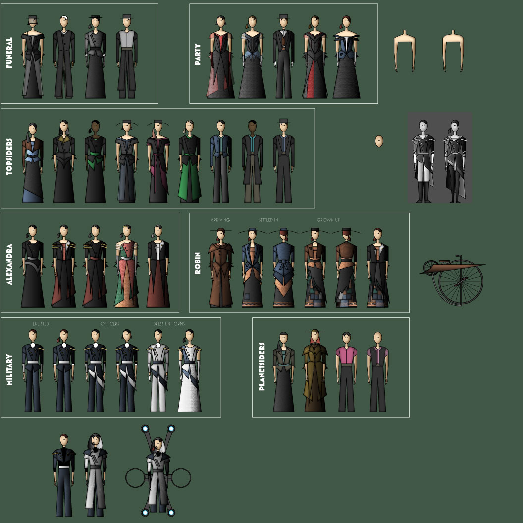
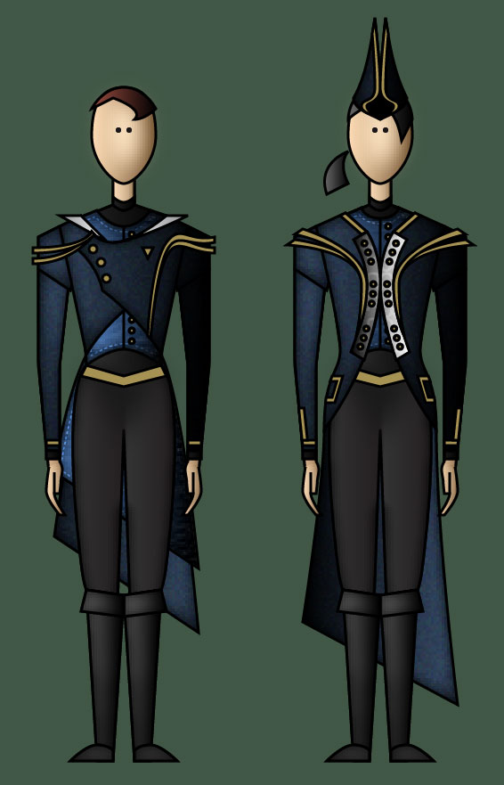
I don’t know what the player’s spacesuit in Tinselfly will look like.

It’s been bugging me. Real spacesuits are super bulky and wouldn’t feel right for this rather magical universe. Your typical video game space suit looks too militaristic and armored for this story. I don’t want my character in something skin-tight, and, oh–since the character could be spending the majority of the game in said spacesuit, I want something really iconic.

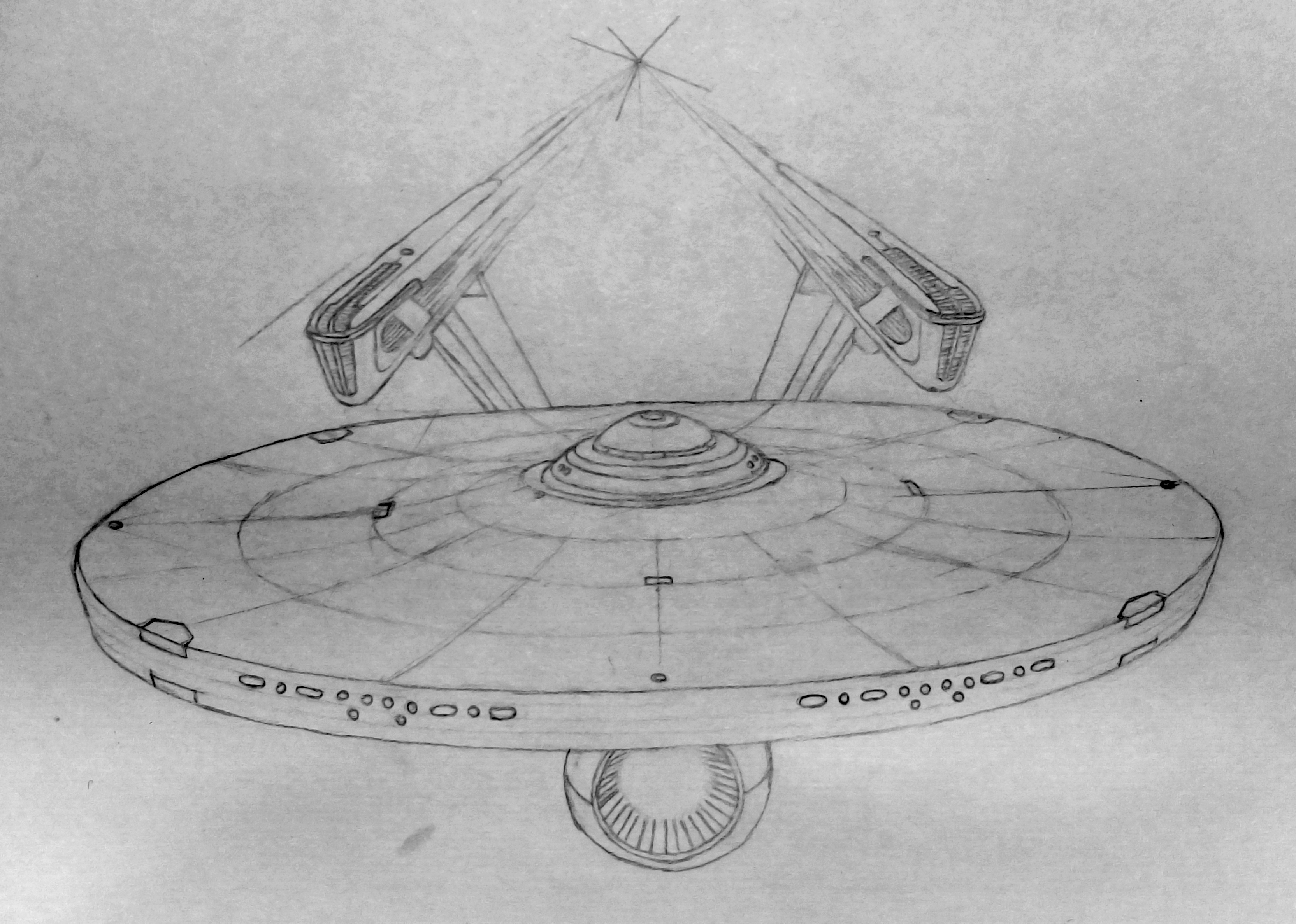
So I drew this wonky sketch to sort out my thoughts:

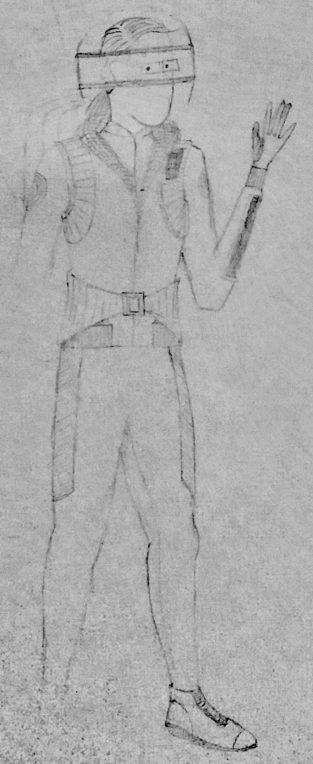
It’s not great, but I think I can work with this.

And when I say I drew this, I mean I had no idea what I was going to draw before drawing it. I drew a basic body shape, layered some clothing ideas over it, erased those, drew something new, erased bits of it, refined my drawing. I drew some loose-fitting pants at first, realized upon seeing them that I wouldn’t buy someone flying with slacks on, and changed them to tights. I drew stuff at random and did Google Image searches at random just to see how I would react to what I saw.

The design process happened almost entirely on a few square inches of paper and my web browser. Very little of the design process happened in my head. And little effort was given to making the drawing look good–the purpose of the drawing isn’t to look good. It’s to quickly explore ideas. I’m guessing that the more I accept that these drawings will look bad, the more useful they will be to me as a designer.

I don’t know how other designers work, but this was very, very different than my usual process. Usually, I try to come up with a clear idea in my head before drawing anything at all, and then I try to do a nice, detailed drawing.

But… I suspect that’s never going to work. I always find that frustrating, and I suspect it’s because, well, I have no mind’s eye that I’m aware of. (Seriously, I don’t, and only recently learned most people do, like this guy.) But I’ve trained myself to do design as if I do.

If I want to design something, I really need to just get to drawing.

And erasing.

And drawing some more.

My sketchbook is my mind’s eye. I should use it better.

* * *

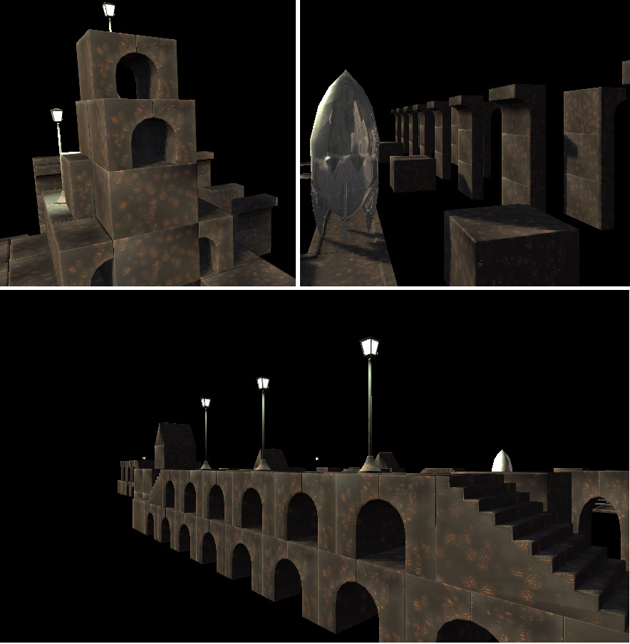
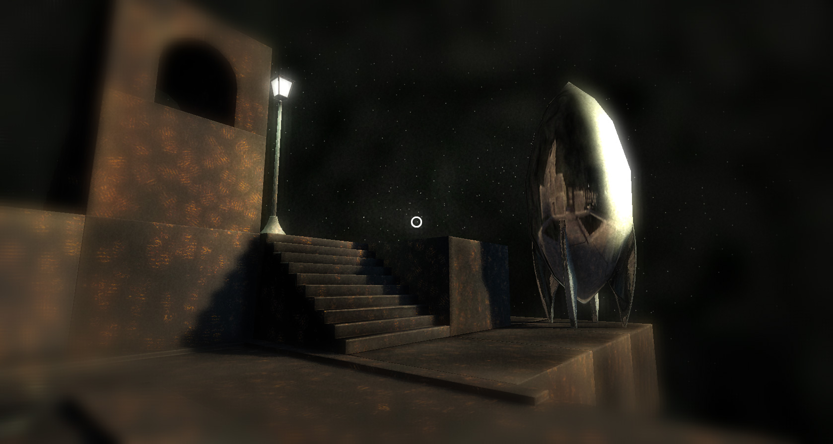
The player in Tinselfly will be spending several hours in a strange, alien world. I have no idea what that looks like, either.

I Googled alien landscapes.

I want the alien world to feel a bit fairy tale, so I Googled mushroom forests.

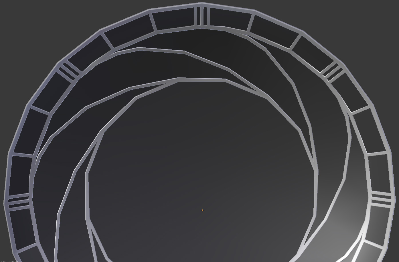
I thought maybe building-sized mushrooms were both too on-the-nose and too Myst so I looked at crystals for a while.

I Googled crystal forests.

None of this was particularly helpful. Everything felt so… mundane. But I only realized that when looking at actual pictures. So I have come up with a new strategy. This place is supposed to be alien, right? So I’m gonna come up with a list of feelings I want the environment to evoke. I’m gonna come up with a list of technical requirements (like, will there be platforming?). And then, without thinking of landscapes or aliens at all, I’ll start drawing some abstract shapes that I think express those feelings and work mechanically. And I’ll build alien vegetation and rock formations and other scenery based on those shapes.

With any luck, by virtue of the process being so divorced from actual landscapes, I’ll come up with something truly alien and unique to this world.


Copycat

My latest practice drawing is done: the Enterprise from the old Star Trek movies.

I’ve drawn this ship many, many times. Mostly in grade school and high school while bored. I don’t have any of those old drawings around anymore, but I suspect this is my best rendition of it.

Part of that, I hope, is that I’m simply getting better at drawing things like this.

But part of it is probably also that I had access to a lot of reference material online, resources I didn’t have access to as a kid. I studied my subject very closely, more closely than I ever had before.

* * *

I think I saw my first vector-drawing program in 1989. The Michael Keaton Batman had just come out, the drawing program has a quarter-ellipse drawing tool, and so the first vector art I ever made was the Batman logo, made of nothing but straight lines and quarter-ellipses.

Later on, I would reproduce logos as a way of learning whatever new vector drawing programs I found. And when I discovered 3d modeling, I modeled the starship Enterprise.

I’ve made the Enterprise in Alias Sketch, AutoCad, TrueSpace, 3DS Max, Blender, Strata 3D, and even a custom modeling program I once worked on.

I’ve drawn the Enterprise on paper more times than I can count.

And this work has no value. None at all. It never occurred to me, while making these copies of logos and spaceships that I might want to spend my time producing work that had value. I was just learning.

* * *

I tried drawing many of the details of the Enterprise above from memory… and I could never do it. I always got something dramatically wrong. You’d think, after so many times drawing this, I’d be able to just do it… but to my surprise, I can’t.

I forget if I’ve mentioned it here before, but I cannot make pictures in my head. I only recently discovered that other people can. For a great overview of what it’s like to realize that, check out this Facebook post from Blake Ross.

I have no desire to dwell on it; I don’t see it as a huge limitation or disability or anything. But it does behoove me to keep it in mind — for example, I’m reading articles about learning to draw or write or compose music and the instructor mentions a technique involving visualizing something in your head, I’m going to have to remember to find a different strategy.

When drawing, I may need visual references more than most illustrators — even if those visual references are sketches I myself made. If I’m designing something, rather than just copying, I should keep my initial quarter-sized thumbnails around when making notecard-sized sketches. And keep those sketches around when making full renderings filling a page. I can’t keep my initial design explorations in my head, so I need to keep them somewhere out of my head.

* * *

For whatever reason, it never occurred to me to take this copying-things approach with music composition, not until yesterday. I have always been trying to learn to compose music by producing music for games. I decided last night it’s time to take a step back. It’s time to copy things.

So last night, I got to work reproducing this one track from Tomorrowland. After an hour, I had one measure. Which was incomplete. It was kind of stunning, how little I got done. My problem wasn’t writing; my problem was listening.

I can’t identify the instruments being used in the piece.

There are these frenetic arpeggios in the beginning and I can’t place all the notes.

My music composition software offers portato, marcato, and martele strings, but I have no idea what these styles sound like in real music.

Taking a further step back, it’s time to listen more. Not just listen to pieces and understand the melodies, but listen to the sound and learn how to deconstruct what’s going into any particular sound.

This is going to take a lot of willpower to do. I know me. I have a few things I’ve composed that I like, and I know that I’ll resent having to go back to the basics here because I can already do things. But doing isn’t my problem right now. Knowing is.

I can do things without really knowing what I’m doing, and that’s not good.

Regular Drawing #1: Computer Mouse

I am trying to draw more. Drawing by hand, pencil-and-paper drawing. It’s not something I really do regularly anymore.

I was having trouble deciding what to draw, so I drew my mouse. 🙂

Here’s how it came out:

It sounds like a really boring thing to draw, but just comparing the mouse to the photo of the real thing, I notice some issues and now I’m glad I did this. The details are decently accurate, but the overall shape is kinda off. The mouse is too skinny in the middle, too wide at the ends, and the highest point on the mouse should be much further back.

Also, not all the details are right. The rear side button should have an angled edge, and the curve on the side below those buttons shouldn’t go straight down at the bottom, but curve back towards the front of the mouse.

I didn’t notice any of this until the drawing was done.

Now that I’m thinking about it, I think these sorts of shapes-not-being-right issues are fairly common for my drawings. I should probably spend more time studying my subject — both before and during drawing. Once I start drawing, I think I kinda stop seeing the overall shape of what’s in front of me. I should stop more and compare my drawing, overall, to the overall shape of my subject.

So I think my next drawing will also be a still object. And hopefully I can keep this stuff in mind and do a better job next time.

Global Game Jam 2015 Postmortem, Part 2: Building Blocks

(Part of a series. Check out Part 1 if you haven’t seen it yet, where I talk a bit about pregaming.)

So Marie and I had come up with several approaches that might work for a game jam… all we needed to do then, was wait for the theme announcement and come up with an appropriate game idea that fit both the theme and one of our chosen genres.

The theme was ‘What do we do now?’.

I was not feeling particularly inspired by this theme.

Luckily Marie was coming up with story ideas so quickly I could hardly keep track of her:

  1. A driving sim where you were tweeting about events happening outside the car, while simultaneously trying to maintain control of your vehicle, a commentary on what we, modern society, do now.
  2. A Myst style puzzler where the world is destroyed by aliens and you have to collect artifacts from your lost civilization, using your own journal entries as a guide to finding collectibles.
  3. A platformer where you play a tin soldier and ballerina doll who get fused together.
  4. A post-apocalyptic platformer where you’re a Cleveland steel worker.
  5. A dating sim that starts after a video game hero has rescued a princess and realizes the princess just isn’t into him.

I found #1 a bit mean-spirited for my tastes. #3 and #4 would have involved character modeling and animation, which I wasn’t at all confident I could do in the time we had.  So after much debate, we decided on the Myst puzzler, since it seemed to have the most interesting narrative possibilities and best distribution of labor. We would go with a hybrid of our pre-selected genres: it would be Myst-like, with journals written by Marie, but instead of having me do all the level assembly, we’d do it tile-based. So I could make generic building blocks and Marie could assemble them.

Blocks!

I started modeling blocks immediately.

blocks

Like our test project, my goal was just to get some basic shapes out quickly, so Marie could get started on level design as soon as possible. I did the large cube and stairs seen above, plus some flat ‘street’ pieces. Then I moved on to texturing, and Marie started placing blocks in her level, which was a bit sloggy.

Thing is, I was looking at all this the wrong way.

I was thinking in terms like, what are the most generic, useful pieces I can make? when I should have been asking myself, what sorts of things will Marie find fun and exciting? The thing with blocks is, blocks are for playing with. For exploring ideas. They’re not just generic pixels, and they shouldn’t be overly specific, either.

Later in the game jam, Marie asked for a half-arch piece, and once I made that, she was much more excited about level design. It was a fun piece to play with. It added tons of interest to scenes. And Marie was able to use the arch piece in ways that I wouldn’t have expected: in building details, broken bridges and this one really cool aquaduct-like structure.

rusted-embers-arches

Texturing

I was very nervous about texturing because, as a post-alien-invasion Earth, you’d expect lots and lots of junk. Rubble. Rebar sticking out of things. I had no idea how I was going to do this. But I started out trying to make some realistic asphalt and concrete textures for my street tiles.

It was kind of boring work, and people walking by seeing what I was doing didn’t exactly find it exciting.

And then I realized that it didn’t have to be realistic. I could make blocks that expressed a feeling of a burned-out city, without being a burned out city.

rusted-embers-scrapbook

What I ended up doing was using the same, totally procedural texture on every single building block, a sort of glowing wood-embers texture. This turned out to be a great idea. It gave the game unique look, while simultaneously reducing the amount of work I had to do.

Overall

I’d say the whole building blocks thing worked well — once we had the right building blocks. And on future projects, whether I’m working with someone else or on my own, I think it’s good to remember that sometimes it’s best to make building blocks without thinking too much about how they’ll be used — sometimes, the way they can be used can surprise you.

Immediate Deresolution

I’d like to talk about modeling a bit. I’m saying that up front because it’s gonna take me a minute to get to that part. 🙂

* * *

For a brief period in high school, I regularly had three dance classes in one day. At the time, and up until just now, I focused on the time I was putting into it: an estimated 14 hours a week. It was a pretty decent chunk of time.

But looking back on it, the number isn’t the only thing that’s important. The other important thing was that I had three separate and distinct dance-related activities.

Every morning I had a class on technique. Every afternoon was spent rehearsing pieces for an upcoming show. And frequently, between classes, I’d run off to the studio to work on choreographing and practicing a solo piece.

And in each of these three activities, my mindset was different. Sometimes I was focused on being creative; sometimes I was not. Sometimes I was trying to stay in sync with my classmates; sometimes it was just me, learning to keep an eye on myself in the dance studio mirrors; sometimes I wasn’t looking at anything at all, trying to develop a good sense of balance and positional awareness. There was a specific time for each little thing I needed to learn, to get better at what I did. And while I wouldn’t say I ever got to be a great dancer, having those things separated out, was, in hindsight, a great thing to have happen.

* * *

In an attempt to improve my skills and efficiency in, well, pretty much every creative thing I do, I am going to try integrating small-scale game-making exercises into my regular project rotation. It’s kind of like a different classroom environment. I’ve always been a fan of having multiple projects at once so they can kind of creatively feed on each other, but I don’t think I’ve specifically drawn a line before and said, these things are for production; these things are for learning. I want to make sure I spend time in both mindsets, and really commit to one or the other when I’m working so I can learn more about whatever I’m working on.

* * *

My first assignment is an arcade-style thing meant to teach me about level design. My second, which I’m working on at the same time, is a spaceship flight sim where the emphasis will be on modeling and making responsive, natural-feeling player controls. I’m afraid I don’t have much to say about the former right now, but in regards to the latter, I learned a little bit more about how to make low-polygon meshes this week.

My first job is to model a spaceship cockpit. Right now, it looks vaguely Star Wars-y: there’s a big, round window with a decorative grill.

Cockpit

And here’s what I’ve learned the hard way: making a low-polygon mesh is not about making a high-polygon mesh and then simplifying it. You have to think in terms of the simplified version before you even start modeling.

I’ll explain that by way of a simplified example. Suppose you want to model this:

deresolution1

If you want to use this shape in a video game, you have to turn it into something a video game understands: a mesh made of triangles. Like so:

deresolution4

While each triangle has perfectly flat sides, the appearance of curves can be simulated by using very small triangles. When you use enough small triangles, you get the appearance of smooth curves.

deresolution5

Unfortunately, more triangles frequently means slower games. It’s not the only thing that can affect the performance of a game, but it is something you need to worry about. And I always start off by making meshes with too many triangles.

The obvious solution here is to take the high-resolution mesh and systematically remove detail from it. Here, I’m using a subset of the points used in the detailed mesh.

deresolution6

Check out the area where the small circle meets the big circle — there’s a sort of Y intersection there. And in this mesh, the widths of the strokes all around that Y feel totally wrong. And the inner circle is a little thinner than the outer one.

What’s happening here is that I’m reducing the number of triangles in the mesh without any real awareness of or respect for when the mesh actually represents. I’m treating this as a series of outlines, like so:

deresolution2

The relationships between each of those shapes is getting totally lost. What’s really happening here, of course, is that I have two outlined circles that need to feel circular in the final product.

deresolution3


I need to not reduce the triangle count the intersection of the two circle outlines. I need to reduce the triangles in the individual parts of my mesh —

deresolution7

— and then combine the derezzed versions.

deresolution8

Now, that Y intersection where the small circle meets the big one looks much better.

I’ve also made a change to how the simplification of the circles happened here.

If I have this circle:

deresolution9


And this overly-detailed mesh:

deresolution10


And then systematically remove points on my mesh, I get this–

deresolution11

–I get a shape inscribed within my original, a shape which is much too small to be an accurate interpretation of the original.

The new mesh should have around the same area as the old one. Like this:

deresolution12


Note that the vertices of the hexagon here aren’t on the circle. My simplified mesh doesn’t actually contain any of the points on the old mesh.

* * *

Of course, it probably wouldn’t be that useful to model individual parts of something and then use your modeling program’s boolean tools to combine them. Rather, the thing I’ve learned here is that I should start thinking in terms of a simplified mesh earlier, and model that–rather than modeling something that’s too detailed, and then programatically simplifying the detailed version (whether it’s an actual simplification utility in your app, or just thinking too programmatically).

In Period

Been working on this texture for an old-fashioned stereoscope. It’s the first object you’ll see in Tinselfly.

Like everything else lately, this has been going slower than I’d like. And part of the problem is defining the problem I’m trying to solve.

The obvious problem is this:

Make something that looks like it was made in the 1920s.

Before I get into what’s wrong with that statement, let me talk a little about where I’m coming from here: Bioshock and Bioshock Infinite. They’re beautiful games with fun, period settings. But all the posters and signs you see in those games look maddeningly inauthentic to someone like me who’s studied the history of graphic design. In short, almost all the type you see should be hand-lettered; hand lettering takes a lot of work, but it’s something I have the skills to do, so I’d like to do it to make my stuff feel more authentic.

So back to making 1920s-style designs: That statement could mean a lot of things. The real question is, who’s looking? And when I asked myself that, I realized I was really asking myself to solve a different problem:

Make something that looks modern, to someone living in the 1920s.

And making something that authentic is way beyond the scope of this project. Like I said, hand lettering is hard. It’s adequate to say:

Make something that looks to a modern audience like it came from the 1920s.

This is not about being authentic for its own sake: this is about communicating something to a modern audience.

But this is, again, a loaded statement — what modern people am I talking about? Without really thinking about it, I realize I’ve taken the problem to mean:

Make something that a modern expert on 1920s illustration would identify as coming from the 1920s.

When it really should be:

Make something that a casual, modern observer would identify as coming from the 1920s.

This is close. Really, really close. Phrasing the problem this way frees me up to take a lot of shortcuts:

A casual observer may not notice how I’ve added procedural jiggling to my letters rather than doing real hand lettering.

A casual observer will not care too much if I use more ink colors than a real 1920s print might have contained. (And using more colors, in this case, actually makes my job easier).

A casual observer may not find the cel-shaded spaceship above too jarring (drawing that by hand would have taken lots more time).

In short, a casual observer will be much more forgiving of the errors I’m making than I will be. There’s a lot that’s inauthentic about the image above. And that’s ok.

If I want to keep things moving, that has to be ok.

So the problem, finally, is this:

Make something that a casual, modern observer would identify as coming from the 1920s and that does not annoy me too much with its anachronisms.

And here’s what it all comes down to: I am not my target audience. I don’t need to spend hours and hours making truly authentic illustrations here. I just need my stuff to pass a quick sniff test.

Despite my complaints, you could argue that the posters in Bioshock already pass said sniff test, and you’d be right. So what I’m going for here is not perfect authenticity — it’s just a slightly more strict sniff test.

And that’s a little more surmountable than the problem I was trying to solve last week.

Almost Human

Been working a lot on my Sam model for Tinselfly lately. I think it’s starting to look pretty nice.

character-3-june-2013


Here are some disconnected thoughts about the whole thing:

  • If you told me a few months ago that that best way to do this would be to manually create and move every single point on the model (instead of using higher level tools of some sort) I totally wouldn’t have believed you. But that’s exactly what I’m doing here.
  • Right now, I’m just concentrating on making something that looks like human — not this human. Sam will be dark-skinned, with a wider, flatter nose than this and fuller lips.
  • Sam is probably dark-skinned because I have pretty in his character description. It wasn’t a conscious decision; I just think of dark skin when I think ‘pretty’. I don’t know what, if anything, that says about me.
  • I added some tear ducts. It may seem like a stupidly tiny detail, given that this character will be like two inches tall on screen, but that really helped me understand the shape of the eyes.
  • I am not using any specific reference. I am not tracing a photographed model or a hand-drawn character design. That would probably make things easier, but I am finding that using references of all ages, races and genders is helping me better understand facial structure in general.
  • I’m not sure what’s up with the shading on the chin, lower lip, and above the ear. As far as I can tell, everything’s pretty smooth there. Gotta look into that.
  • It’s nearly impossible to work on the ears without frequent renderings with shadows turned on.
    ear-3-june-2013 Without shadows, the ear is just a strange blob; so much of what we think of when we think of ears isn’t shape, but color.
  • My model (including the body) has something like 15,000 triangles right now. I don’t know if that’s acceptable or not.
  • I can’t wait to move on to Sam’s costume. 😛

Self-Documenting Mesh

Over the last couple of weeks, I’ve been working on a character model for Tinselfly, and I’ve learned that it’s not enough to make a mesh that looks right. Just like classes in a computer program or layers in an Illustrator file, getting something to work is one thing; getting it to be sensible and maintainable is quite another.

So here are a few things I’ve learned lately.

torso-old

The torso above is functional, the way a hastily constructed computer program is functional. It has the right shape. There’s a neck and body and arms and some definition to the collarbones.

But from an organizational standpoint, it’s a complete mess. Compare that to this torso:

torso-new

Here, I’ve created a pretty strict grid. The overall shape is basically the same, but it’s easier to tell what’s going on. My mesh doesn’t just need to have a certain shape: it must also communicate to me, the modeler, what that shape is. Like well-named variables and functions, this mesh is self-documenting. I can look at these long, smooth curves on the grid and get a good sense of what those curves represent in three dimensions. I can’t really do that with the first torso; the lines, such as they are, are jumbled and jagged.

Working in this sort of way also makes editing easier. The modeling software I use has built-in tools to select whole lines or circuits on my grid, like the orange lines here:

torso-new-loop-select

I can also add detail to my mesh fairly easy. If I decide my character’s sides aren’t smooth enough, I can quickly add a loop cut, shown in purple here:

torso-new-loop-cut

Loop cutting breaks every square along the loop in half, so I can refine a specific area. And once cut, my mesh is still a nice, neat grid which can be further refined with more loop cuts.

torso-new-loop-cut-after

Just imposing a grid on the mesh isn’t enough, though. This face has a simple grid structure:

head-old

Trouble is, this grid isn’t structured that logically. I probably wouldn’t want to take a random cross-section of the face and move it, or scale it, or whatever.

head-old-loop-cut

If I want to add some detail to the eye sockets, I could add a loop cut, like I did with my torso. But this loop cut wouldn’t just affect the eyes: it would also add lots of unnecessary detail around the temples and back of the head.

So what I need to do here is change the way the grid works, just in one localized area. Like so:

head-new

Here, the area around the eyes is its own closed polar grid, while the rest of the face retains the square grid it started with. And now, if I want to add detail to the eye sockets, I can add a circular, eye-shaped cut, like this:

head-new-loop-cut

That loop makes sense to me. It represents an area of the model that I think of as one unit. And again, just seeing the polar grid around the eyes helps me understand the geometry of the eyes, more than the previous approach did.

One thing I’m struggling with here is this idea of adding pockets of detail. Suppose, for instance, I wanted to smooth out the contour of the eyelid. Right now, I’d have to add a loop cut like this:

eye-loop-cut

…Which will add extra smoothness around the eye, but will also add unnecessary geometry down the cheeks, and along the neck, and who knows where else. I’m trying to come up with simple, general-purpose strategies for adding detail, like this method of smoothly transitioning from a coarse grid to a finer one.

grid-resolution

That might work in some instances, though maybe not the eye specifically. I still have much to learn here.

Wider, Fatter, Stronger, Better


A stupidly long time ago, I posted these costume ideas for Tinselfly.

costumes

And somebody commented how it was funny how all those little people, boy or girl, young or old, kinda looked like me. The long, mouthless faces, the skinny bodies.

I am skinny.

Oh, sure, I’ve gained a slight belly in the last few years, and my mother pokes it whenever she sees me, but I probably still qualify as skinny to most people.

When I sit down to draw or model a a character, I think of myself as a baseline. If the character is described as thin, I’ll try to make them thinner than myself.

And then I wonder why they don’t look quite human.

I am a bad baseline. But just saying that doesn’t give me a tangible sense of what the baseline is. So let’s try to throw some numbers at this.

I’m 5’11” and barely reach 150 pounds most days. I know BMI is problematic, but that puts me right at ‘normal’ according to the CDC. And by ‘normal’ they mean ‘healthy’. Average for a an American is apparently like 50 pounds heavier than I am.

According to this handy figure drawing book I’ve got, an average male has a hip width/head height ratio between 1.5:1 and 2:1. I’m 1.4:1, below the bottom of that scale. Also, my shoulders are thinner than the book’s average, at around 1.5 heads to the book’s 2.

So I’m not just a bad baseline; I’m a really bad baseline, and I’d still be a really bad baseline if I gained lots of weight, because of the slightness of my frame. I guess I already kinda knew that, but the numbers help cement it. An ‘average’ adult male would have a wider frame than me, by several inches; and they would weigh significantly more. I’m not sure how weight translates to bulkier shapes when drawing, but it’s fair to say my characters should be a lot bulkier if I want them to look like average, ordinary people.


Sam is Pretty


I’m kicking off my more-natural-looking Tinselfly characters thing by not doing my lead. I’ll do a supporting, but playable character named Sam. He’s in the Navy, and will be wearing a uniform like the character on the left here:

uniforms-4-april-2013

This should be well within my abilities to model. Sam will probably have a shaved head, so I don’t have to worry about modeling hair. His uniform is neatly tailored, so I don’t have to worry about drapery or wrinkles. He’s tall and thin, so my current NPC model isn’t too far off from his body.

And he’s pretty.

Why does that matter? Because, from a certain point of view, pretty = less complicated. Smooth. Symmetric. Crisply defined.

Fewer polygons.

* * *

Part of modeling a character is getting to know the character–and I’m already starting to do that, having done nothing more than take the head on my old model and start to make it more natural looking. Which is good, because Sam is mostly defined in terms of being a foil for the lead.

sam-4-april-3013

So here’s what I’ve got so far: when I say ‘Sam is pretty’ I don’t mean that pretty is a thing that Sam naturally is. I mean to say that Sam puts work into being pretty; it is something he values. This is part of his character, not part of his appearance.

Sam looks quite dashing in his uniform, and knows it. But it’s not vanity so much as an obsession with neatness, and an aversion to things that are unorganized.

This works out well, because I’d planned on having a level where Sam is exploring the jumbled fragments of a destroyed, floating city, and having Sam try desperately to put part of the city back together in his head could make for interesting gameplay.

* * *

I also like starting with Sam because said exploration level is fairly self contained; I can just dive into it without worrying about how it ties in with other things. It would be a good starter level, and I desperately need one of those.


Copyright © 2017 Brian Crick.