Brian Crick

Reinventing Wheels

I really dislike most color pickers in games. You’re usually presented with a dizzying grid of color swatches, or some sliders that aren’t the most intuitive things to use, even for someone who spends a lot of time in graphics programs.

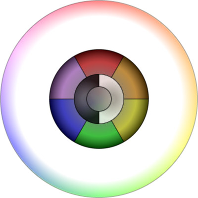
So I wanted to design something a little different for the character & costume creation in Tinselfly, something that lets you easily drill down to the color you want and go.

At first, you’ll be presented with a simple menu of things to choose from.

You can click on one of the primary colors, or one of the three shades of grey in the center.

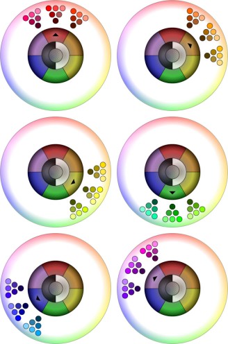
If you click on a primary color, you’ll get some different variations of that color, so the color picker would look like one of the six variations below:

The new colors shown are further categorized by hue, and within each triangle of similarly-hued colors, you can pick a lightness and saturation that you like.

Similarly, if you click on one of the greys, you’ll get some variations that let you refine your color.

And that’s the basic idea.

I think this interface does a reasonable job of looking uncomplicated, even though there are still a couple hundred things to choose from. However, I don’t think it’s obvious how you’re supposed to interact with this thing. Some labels, bevels or general instructional text is probably needed.

Reticulating Splines

Well, this is very Hollywood OS.
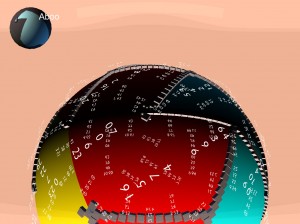
I’ve been working on map generation for Tinselfly, and have been having some trouble with that. And last night, I wasn’t just having trouble with my code; I was having trouble figuring out how to even begin debugging my code.

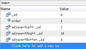
The world here is made of a bunch of triangles, and I wasn’t sure I was creating them all properly. So after an hour or two of slogging through my debugger and inspecting properties for my objects, I thought I’d just add some debugging information directly to the game world. So all the text you’re seeing, that’s information about what order my triangles were created in, what their unique IDs are, and which other triangles they’re adjacent to.

As you move around, the text moves too. Because the text is, after all, part of the game right now.

It looks like overkill, but it’s been immensely helpful.

* * *

1993. SimCity 2000 has just come out. I’m sitting in a computer lab, working on a 3d vector-graphic tank game in Turbo Pascal, a little like BattleZone.

Sure, it’s just primitive vector graphics, but it takes an insane amount of preparation to get a 16mhz computer to do this, in a programming language designed for learning, not for efficiency. Before you can draw a single graphic, you need to create a bunch of tables that the program can look at, so instead of solving complex, but common math problems every frame, it can just look up the solutions in a table.

Creating these tables takes the program a couple minutes. To make the wait a little more tolerable, I add in some messages about what the program is doing and how far it’s gotten. Some of the messages are useful. Some of them are not; they’re just silly, nerdy technobabble. Like the ‘reticulating splines…’ message in SimCity.

A not-so-nerdy friend of mine walks in and sees my program running. While he’s not as into programming as I am, he immediately picks up on the fact that this technobabble isn’t what it seems to be. He accuses me of trying to make my stuff look more involved than it really is, and walks out.

It isn’t a playful jab. He’s sincerely disappointed.

I’m mortified. Because he’s right. Sure, there really is some complicated math going on here, and getting this to work was no small feat. I want people to know that. Even the simple act of drawing a single line on the screen requires custom code that I’m proud of having implemented on my own.

But my status messages should have communicated exactly what I needed to know; no more, no less. I strip the messages out. They weren’t in my program for more than fifteen minutes.

But for years after this, I’ll be very nervous when talking to non-technical people about programming tasks. I’ll be very careful to choose words and phrases that are clear rather than impressive.

* * *

The moment I saw that globe with those numbers floating around it, I started to worry that this was more about making me feel proud about doing something complex, and less about solving a problem.

However, my problem with Tinselfly right now is all about spatial relationsips. It makes sense for my debugging information to be presented in a graphical way, rather than the text-only debugging screens I’m used to.
I kind of like silly, overproduced computer interfaces in movies. I sometimes think those computers might be fun to use.

Though in reality, overproduced interfaces just get in the way a lot of the time. You’ve got to have exactly as much interface as you need. And sometimes, just sometimes, what you need is a bunch of transparent numbers swirling around a colorful sphere. Which is kind of cool.
Absolute Position

I finished my mini map! With, like, 40 minutes to spare. 🙂

What’s New

(The Short Version)

First, the map is divided into different colored areas. They don’t really mean anything right now, but they’ll become important later.

Next, there’s a globe in the upper left corner. There’s a little arrow showing you where you are, and the colored area you’re currently in is highlighted.

User Interface Design Rambling

It was surprisingly not-straightforward to make that globe.

But the basic idea — and the reason it was so complicated — is that I’m very picky about how to communicate position to the user. I want the user to think of the world in terms of a small number of discrete, countable areas. It’s all about chunking. You’ll notice that as you move around within an area, The globe doesn’t really move much, but if you enter a new area, the globe will swivel to give to the best view of whatever area you’ve entered. I want the user to remember the colors of the areas, and the shapes of the areas, and if eventually the areas have names, I want the user to remember those, too.

So they can divide the world into manageable parts, and hopefully, that will help them navigate.

There’s a slight complication because the world is round here. Say I was using a map of the real world here, and my areas are continents instead of colored blobs. You start in North America, and the globe shows you North America, with Canada at the top and Central America at the bottom.

So you move around, and go visit the other continents, and when you come back to North America, suddenly Canada isn’t on top. It’s on the side. You never rotated the camera or anything, but it’s just the way navigating on a sphere works.

At first, I added some code to re-orient the globe to that North was always up, so that when you went to any given area, it was rotated the same way as it was the last time you were there. And that was nice and all, and it really helped reinforce the shape of the area and your memory of the area, but it was hard to tell what exactly would happen when, say, you pressed to up key. The arrow wouldn’t necessarily move up.

So instead of having a canonical rotation for each area, I’m just orienting the globe based on the orientation of the camera. And yeah, that can change over time, but I think that with the unique area colors and shapes it will still help with navigation the way I want it to.

Next Up

By Saturday night next week, I’d like to have my map generation more complete, with obstacles on the boundaries between areas.

Copyright © 2017 Brian Crick.