Brian Crick

Variations on a Theme

Well, that was a nearly perfect weekend. They’re so much better when I actually follow my own rules for managing them. 🙂

In addition to visiting the wonderful new Greater Cleveland Aquarium , visiting friends, exercising and going out with Marie, I managed to get through a full cycle and a half of pet-project work. There are six things on my plate at the moment; here are the weekend’s highlights.

* * *

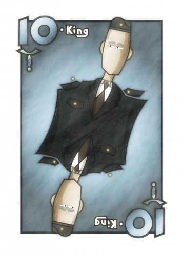
Made a King of Swords for the Scopa deck. I was really happy with the medal salad going on there, though it got lost when I applied all my Photoshop filters. I’ll have to up the contrast on that a bit.

* * *

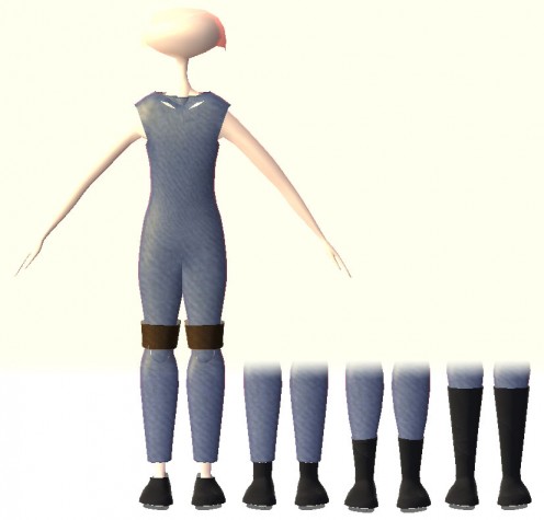
Am continuing work on my generic procedural NPC costume thing for Tinselfly. So what you’re seeing below is my test character, wearing a pair of boots whose thickness and length can be set to arbitrary values by the game at runtime.

It’s a bit sluggish, but you can watch this stuff animate in the game. It’s kinda spiffy. Need to work on adding procedural seams and details to things next.

* * *

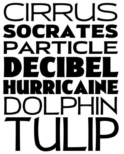
My new font is starting to look like ya know, a font family. Whee! I’m really happy with how this is turning out.

Heart of Neutrality

I attended my second Cleveland Game Developers meetup last night, and (gasp!) I had a lot of fun. It’s a pretty diverse group, with as many artists as programmers, so my fears of being surrounded by other technical types were largely unfounded.

I even got to offer advice on music software to someone there. It’s a great feeling, to be in a position to be helpful to someone you don’t know personally.

I kinda like networking events. I know they’re the bane of many people’s existences, but there’s a time and place for the sort of neutral, casual conversation you get at things like this. Sure, being overly friendly at a networking event can be awkward, and if you’re having networking-type discussions with friends, that’s just depressing… but I feel a strange sort of calm talking to people I’ve never met before, who I may never meet again. It’s kind of liberating.

* * *

They’re pushing this Game Jam thing where you’re given a theme for a game, split into teams, and have 48 hours to come up with something interesting. I’m not really interested in doing a 48-hour programming challenge… I just don’t think I’ll find such a thing particularly fun or relevant to the specific programming skills I need to work on right now. However, if I attended as an illustrator or a fledgling musician, assigned to a random programmer, I think that would be an interesting experience. I could use the practice thinking quickly and doing those sorts of creative pursuits under absurdly tight deadlines.

As I understand it, they’re short on illustrators and musicians anyway… need to confirm that, though.

* * *

Watched Apocalypse Now for the first time last night. It may not sound like it, but that’s kind of a big deal. As someone with a dad who’s a Vietnam war veteran, Vietnam war movies simply didn’t exist in my chilldhood — or young-adulthood. The war itself was never spoken of, and I only know details of my dad’s involvement in the war secondhand.

Sure, I’ve seen Good Morning Vietnam and Heaven and Earth but those aren’t focused on combat so much.

So anyway, I watched it, and failed to find it particularly disturbing, or horrifying, though my impression is that it wanted to be those things, and succeeds for most people. I sorta wonder if there’s something wrong with me there. I’ve found maybe one or two movies in my life disturbing.

Then again, going back to the whole war-veteran thing… of course, I’ve never seen real warfare, but I’m pretty sure that no movie is ever, ever going to come close to capturing even the secondhand account of this event in my head, cobbled together from a couple decades of whispers and worried looks.

You want to flesh that out in a 2 or 3 hour ‘epic’? Please. I may just laugh at you.
Fun with Font Blending

Now that I’ve cleaned up my untitled square sportsy font a bit, I thought I’d mess it up again. 🙂

I had this critiqued by some experts in the industry a few years ago, and they suggested that it might work well as the widest variation of a whole family of fonts. I’ve never tried that before, but I’ve decided to give it a shot.

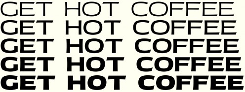
What I’m hoping to end up with is a 15 font family: you’d be able to pick any combination of one of five weights and 3 widths. Above, you can see what the 5 different weights might look like for the widest available width.

Luckily, I don’t have to make all 15 sets of letters from scratch; the way it seems to work is, you just define the extremes, and let your font-editing software blend between them.  In the end, I’ll need to draw each character 4 times: narrow/light, narrow/extra-bold, wide/light and wide/extra-bold. What you see above is the two wide extremes blending together.

So it’s arguably 4 times as much work, but you get 15 times as much product, a more versatile product that hopefully will appeal to people with big, complex typesetting jobs.

But the ratio of work-to-product isn’t really what I find appealing about this. What I like about it right now is that working at these extremes is pretty unforgiving. The thinner the strokes, the easier it’s going to be to tell when they’re inconsistent. And with the extra bold characters, it’s been a bit of a challenge to cram everything in without having things look too crowded or muddy. And, I’m sure that the narrow versions of these will have their own unique problems to deal with.

It’s like you’re exaggerating the problems already present in the design. If I can figure these issues on the edges of my family, I’m sure the middle will be much better for it.

Autosave

For no particular reason, I worked a little on an old font today.

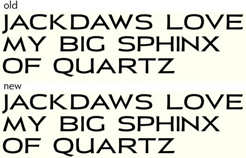
The changes are pretty minor. I’ve made the curves on letters like O and B more smooth (while still trying to retain the squarish look of everything), and slimmed down the strokes on the X, B and W so they match the other letters better.

You kind of have to squint a bit to see the changes. However, I think this is a bit more professional and clean looking now.

* * *

One of the nice things about working on fonts is, you can let something sit for a few years and pick it back up, and you don’t have to spend a whole lot of time re-familiarizing yourself with what’s going on. This font was last edited in 2009 I think.

Contrast that with my Dart board game project, which was a bit baffling to sort out today, after having gone unedited for a couple months.

* * *

It occurs to me that this whole saving-journal-post-drafts-in-Wordpress thing is backfiring.

See, I used to post everything directly to LiveJournal, which seemed incapable of reliably saving drafts. So if I wanted to write something, I had to do it all it one sitting, or at least have my post-editing page open all the time, beckoning me to come back to it. With WordPress, I can save a draft, leave the WordPress interface entirely, and completely forget that I was writing something.

There are any number of saved drafts on my site here, waiting to get edited. Chances are, I won’t get back to them. And that’s part of why there haven’t been many posts here lately.

As with most things, I think my posts are better when they’re just a little bit rushed. Everything’s more focused that way.

So I think I’ll go back to just trying to throw things together all at once here.

Copyright © 2017 Brian Crick.