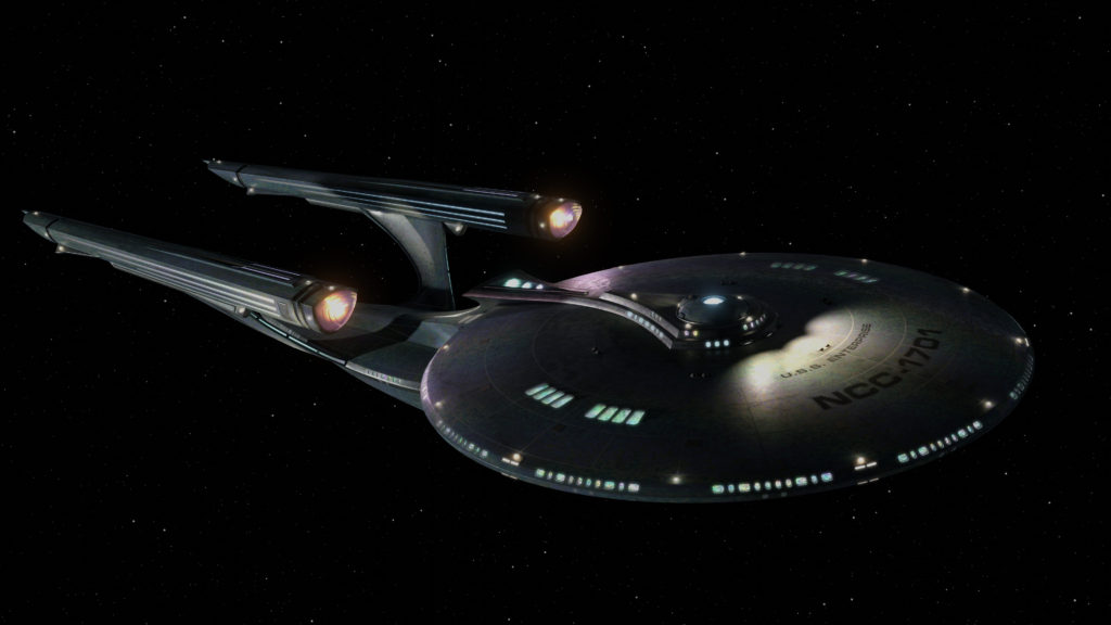
My name is Brian, and I’d like to make the world a slightly prettier place. Here are some of my attempts to do that. I mostly work in Unity, creating 3d environments and figuring out how to make nifty camera effects.
Check out my demo reel!
More stuff around here
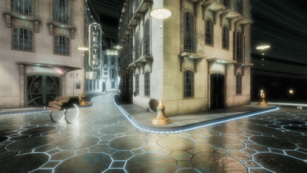
I’m working on some games with the most beautiful environments I can make, and—more importantly—beautiful stories told in new and fun ways unique to the medium.
I also like making random illustrations in a variety of styles.
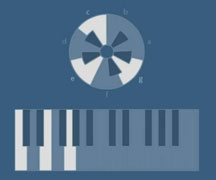
And I’m learning to write music, too!
Have a look around, and enjoy!
About Me
I currently work as a Unity 3D developer for a research group at the School of Nursing at Case Western Reserve University.
We make games that teach people how to get the most out of hospital and clinic visits.
In my free time, I like working on a variety of side projects, ranging from web sites to video games to fonts. I did freelance design for a while, and a few of the sites I made are shown here.
I have a Bachelor of Arts (yes, Arts in Computer Science from Case Western Reserve University.
I don’t have much formal design training, just a desire to see what I can do and how I can get better at doing it.
My favorite color is blue-grey, my favorite band Au Revoir Simone, and my favorite book is The Joy Luck Club by Amy Tan. I grew up in Tulsa, Oklahoma, and currently live with my family in Cleveland, Ohio.