Been working on this texture for an old-fashioned stereoscope. It’s the first object you’ll see in Tinselfly.
Like everything else lately, this has been going slower than I’d like. And part of the problem is defining the problem I’m trying to solve.
The obvious problem is this:
Make something that looks like it was made in the 1920s.
Before I get into what’s wrong with that statement, let me talk a little about where I’m coming from here: Bioshock and Bioshock Infinite. They’re beautiful games with fun, period settings. But all the posters and signs you see in those games look maddeningly inauthentic to someone like me who’s studied the history of graphic design. In short, almost all the type you see should be hand-lettered; hand lettering takes a lot of work, but it’s something I have the skills to do, so I’d like to do it to make my stuff feel more authentic.
So back to making 1920s-style designs: That statement could mean a lot of things. The real question is, who’s looking? And when I asked myself that, I realized I was really asking myself to solve a different problem:
Make something that looks modern, to someone living in the 1920s.
And making something that authentic is way beyond the scope of this project. Like I said, hand lettering is hard. It’s adequate to say:
Make something that looks to a modern audience like it came from the 1920s.
This is not about being authentic for its own sake: this is about communicating something to a modern audience.
But this is, again, a loaded statement — what modern people am I talking about? Without really thinking about it, I realize I’ve taken the problem to mean:
Make something that a modern expert on 1920s illustration would identify as coming from the 1920s.
When it really should be:
Make something that a casual, modern observer would identify as coming from the 1920s.
This is close. Really, really close. Phrasing the problem this way frees me up to take a lot of shortcuts:
A casual observer may not notice how I’ve added procedural jiggling to my letters rather than doing real hand lettering.
A casual observer will not care too much if I use more ink colors than a real 1920s print might have contained. (And using more colors, in this case, actually makes my job easier).
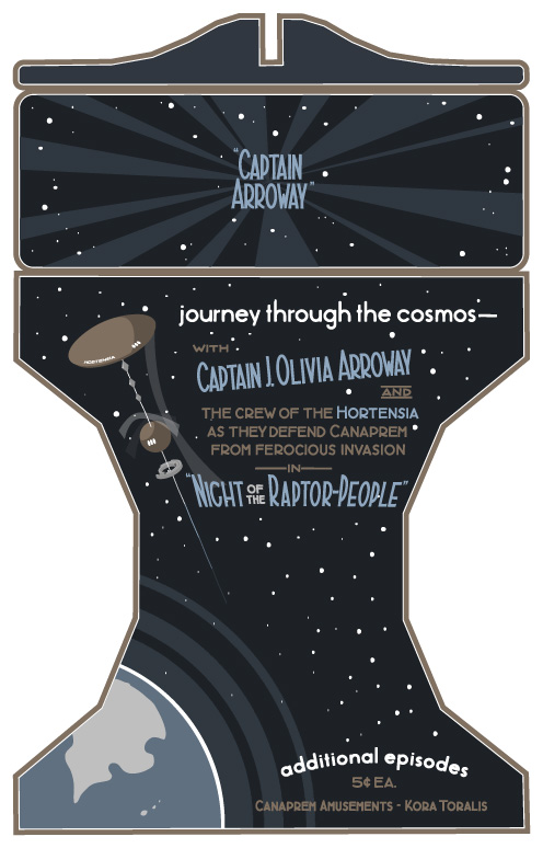
A casual observer may not find the cel-shaded spaceship above too jarring (drawing that by hand would have taken lots more time).
In short, a casual observer will be much more forgiving of the errors I’m making than I will be. There’s a lot that’s inauthentic about the image above. And that’s ok.
If I want to keep things moving, that has to be ok.
So the problem, finally, is this:
Make something that a casual, modern observer would identify as coming from the 1920s and that does not annoy me too much with its anachronisms.
And here’s what it all comes down to: I am not my target audience. I don’t need to spend hours and hours making truly authentic illustrations here. I just need my stuff to pass a quick sniff test.
Despite my complaints, you could argue that the posters in Bioshock already pass said sniff test, and you’d be right. So what I’m going for here is not perfect authenticity — it’s just a slightly more strict sniff test.
And that’s a little more surmountable than the problem I was trying to solve last week.