Recently, I made a logo for someone’s upcoming RPG.
![]()
They wanted something kind of corroded looking; if you view the image full size, you can see how the letters look a bit icky and old.

So I wanted to talk a little bit about how I did that. It’s mostly Photoshop tricks and very little hand-drawing.
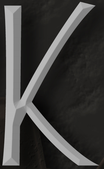
First, I started with some boring grey letters in their own layer.

Then I added a stock bevel and drop shadow — just standard Photoshop effects. You can click on the fx bottom on the layers palette to add these.
I made a generic sort of streaky rusty copper texture like this:

It may look complicated, but it’s mostly stock filters.

On the image above, you can see the results of a Filter->Render->Clouds on top. In the middle, I’ve done Filter->Stylize->Find Edges. And on the bottom, I’ve done a Filter->Stylize->Emboss. And with that, you’re most of the way there.
So I made this great big copper texture and pasted in into my document, and used a clipping mask to make it look like a texture on my beveled letter. You can do that by selecting the texture layer and going to the little arrow menu on the Layers palette and selecting Create Clipping Mask, and what that does is, it uses the opacity of the layer under the selected layer as the opacity of the selected layer itself. But the effects, like the bevel, are still visible.

So at this point there’s a nice color texture, but it needs to look kinda bumpy and worn.
Sadly, I forget how I made this one. 🙁

But it was also pasted into my document, and had Clipping Mask turned on, and I set the Blending Mode on the Layers palette to Hard Light. That makes it so that the colors of the layer underneath are preserved, but you’re sort of adding shading to it. So you can see below how the letter’s still blue-green, but the highlights and shadows in the pitted texture above are coming through.

There’s this sorta lumpy, pitted texture now, but the edges of the letter are still perfectly smooth — it doesn’t look quite right. So I took little bites out of the letter with the Eraser tool, just near the edges, to make it look more like this texture was a three-dimensional thing. This effect is most visible where all the strokes come together in the middle of the letter.

Next, I wanted to add some mineral deposits. Rather than make a custom pattern, I just used this yellowy, lumpy rock pattern that comes with Photoshop.

What I did was, I made a new, empty layer and added a Pattern Fill using that fx menu, and a Color Fill too, to tone down the yellowness a little. And then I just started drawing blobs over my letter.
Part of the goal here was also to hide the flat appearance of the bottom-right part of the K; sometimes, Photoshop’s automatic bevels look a little funny.

That ended up being a little hard to see,and not nearly nasty-looking enough, so I also added a bevel to the mineral layer itself. So it kinda looks like there’s this buildup on the letter.

And finally, I added some more pits, again near the intersection of all the strokes for the letter.
This is a little strange. What you’re seeing below is some beveled dots, but the dots themselves aren’t visible — you can do that by lowering the Fill on your layer in the Layers palette. And what you’ve got then, is the bevel effect applied to the layers underneath the dots.
And there you have it… a lovingly crafted, nasty looking K. 🙂
Great work, and clearly explained. Very nice:)
Thank you! Can’t wait to see how this looks on the finished book cover.