Brian Crick

Girl Wonder Sketches

Here’s what I got last night on the Girl Wonder thing. You’re looking at maybe 90 minutes’ work here. Don’t have a lot of time to work on this.

Since the desired image size is sorta widescreen, I thought I’d have my character standing sideways, on the side of a skyscraper, to fill the space better.

I had a sketch of that (not pictured) and it just wasn’t that interesting visually, so I thought I’d add in a gargoyle that the character could be leaning against. So I drew a quick thumbnail sketch of that.
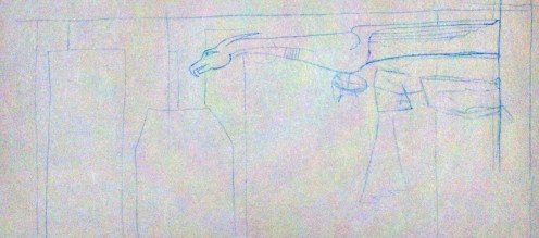
In this composition, the character could be upright and still fit, but hey, I like the way this is balanced. So you’ve got a character with her arms folded, cape hanging down, standing on the side of a building, leaning up against the bottom of a ginormous gargoyle rain spout thingie, with a bunch of skyscrapers in the background.

So far, so good.

Then I started a new sketch just focusing on getting the proportions and body of the character right. Like I said before, I’m not terribly skilled at this.
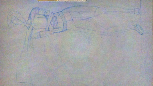
I had my anatomy book open the whole time, and had to force myself to do this in stages: I started with an 8-head-high ruler with little tickmarks on it, used that to draw a simple skeleton (you can kind of see that around the hips and legs) and built the body around the skeleton. Pretty basic stuff as I understand it, but I’d never done that before.

Mostly, I think this turned out quite well; the stages really helped. However, I do have a couple of quibbles.

First, the torso feels too long. My torsos always feel too long. While I think I got the proportions of the skeleton right, I think I made the widest part of the hips/legs way too low. Gotta brush up on my anatomy there, especially male/female differences to watch out for.

Second, I was going for a little bit of contrapposto there (having all your weight on one leg, which results in the hip being all slanty), but I think I made the torso too twisty. There’s a little bit of butt sticking out there, which is the last thing I want. However, I think I’ll leave the basic shape as is, and when I scan in my sketch for real for tracing in Illustrator, I’ll just bend things a bit in Photoshop so the general upper body is more to my liking.

I haven’t given a whole lot of thought to the costume, besides the off-center cape and asymmetric collar detail. I figure I can (and should) design the costume separately from the actual act of figuring out how the body looks in my sketch.

It’s very, very tempting to just give the character a decorative pull-over short-sleeved shirt with a cape, leggings and short boots, and call it a day. There would be nothing particularly feminine or cheesecakey about it; it would be very safe.

But I expect superhero costumes to be a bit theatrical; I’d expect skirts and gloves and shiny accessories. Getting that sort of stuff to work, that’s half the challenge here. And like the formal wear I was talking about the other day, I think it’s important to get at the roots of these design decisions.

Take thigh high boots for example, common in girl superhero costumes. True, there’s a bit of fetishism going on there, and you can be dismissive of that… but they also emphasize the length of the legs, just as the long gloves commonly paired with these boots emphasize the arms. If you’re going to have a character kicking and punching bad guys all the time, you want to draw attention to their limbs. It makes sense. The trick, I think, is to place emphasis where you want it without having it be too obvious to the viewer that there are specific things you want to focus on here.

I’m not sure when I’ll be able to get to this next. I’ve got stuff happening tonight and tomorrow night, and friday night is, well, friday night. 🙂
Girl Wonder

The web site girl-wonder.org is having a contest to design a banner for their Facebook page. Deadline is this Friday.

I’m not real familiar with the site, my people drawing skills aren’t very good, I think it would be tough to beat the refreshingly tasteful banner they’ve already got, and it’s exceptionally unlikely I’ll be able to crank something out that I think is remotely acceptable in the next three days.

So I’m going to drop every other pet project I’ve got for a bit and give this a shot.

I can always use practice working absurdly quickly. I’d like to finally have a reason to open up my anatomy for artists book and practice drawing oddly shaped body parts like knees, which are plainly visible in your typical superhero costume. And I’d like so see if I can actually design a costume that meets my standards for tastefulness and still retains many of the lines you’d expect from this sort of thing.

It’s something I’ve wanted to try for a while anyway, just to see if I can do it.

I’ve already got a broad idea what I want to do… hopefully I’ll have a rough sketch up at the end of the night.

Celestial Stick People Photos!

Got my Celestial Stick People color test in the mail yesterday. Wheeee!

So here’s what you get:

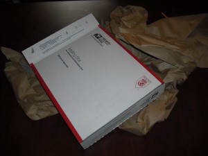
A Postal Service box. It’s big. And filled with lots and lots of paper.
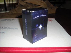
Wrapped up in all that paper, you get a tuckbox. (It’s not shrinkwrapped, which I kind of like. Shrinkwrap is icky.) The box feels very sturdy and crisply constructed.
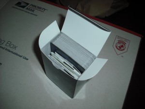
Sadly, I did my math wrong and this test box contains only 65 cards, not the 78 a real deck would have. So it looks a bit loose here. I just tried padding it out with regular playing cards, and everything still fits fine with 80something cards so I think we’re ok.
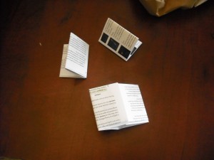
The instructions come as three separate, folded pieces of paper. I’m kinda bummed about that — you have to sort the pages by hand, so I’m glad they’re numbered — but I don’t think it’s a dealbreaker. If I could squish the card reference onto two sheets of paper and have the instructions by themselves on one sheet, that might make all this feel more logical, but I’m pretty sure that’s not really doable.
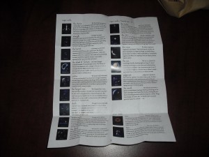
Unfolded, the rules are perfectly readable at least. The folds in the paper are nice and crisp; it’s not like you unfolded a crumpled up sheet here.
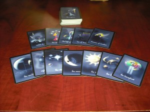
And here are the cards. The registration is ok, and a couple of the 5 sets of samples I got have nice looking colors. They don’t really have that new card smell. Not exactly important, but I was surprised.
So back to the rules.

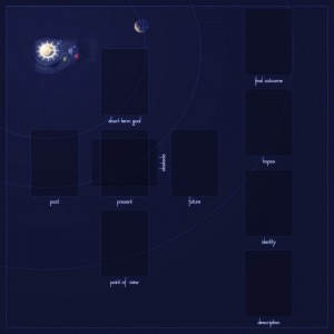
I’d already been considering a ‘deluxe’ edition to complement the regular version. It would come in a big cardboard box almost 11 inches on a side (with a custom label, but not custom printed on all sides) and a foldable 18×18 board, something like this:

I still have a long way to go on the design here, but the point is, you get a nice board, and the rules will be folded less and presumably stapled.

Not sure if there’s really a lot of value there, and I don’t have a lot of time to do anything but grunty, scriptable prep work, but it’s worth considering I guess.

…For What You Believe In

My Celestial Stick People color test should arrive today. For those just joining in, this is a Tarot deck I’ve been working on since November 2000, and I’m agonizingly close to getting it printed finally.

As part of getting all this wrapped up, I’ve been slowly adding captions to the images in my web site galleries, which includes images from the deck, trying to give just a couple sentences’ worth of history or inspiration for each piece if I can remember it.

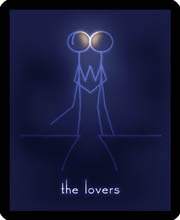
And then I got to the Lovers. It looks like this:

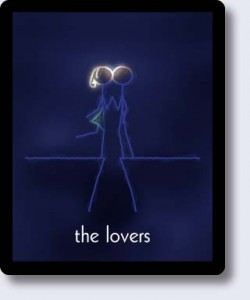
I bring this up because it used to look like this:

The Lovers is supposed to represent love overcoming obstacles. It’s about fighting for love. So very late in this whole process, I changed the characters from a boy and a girl to just two boys.

My color test is not making me nervous. The possibility that this project is simply going to disappear into the Internet upon completion does not make me nervous.

This card makes me nervous.

I’m usually not real vocal about my political or social views. I’m generally not one to post righteously indignat rants; I don’t re-post articles or images on Facebook with statistics or quotes or jokes about causes I care about. I would prefer to express my convictions through the actions I take and the work I do.

This slight rearranging of blue lines, this removal of one yellow blob and one green blob — this is me, taking a stand.

Within my own group of friends, the change to this card was met with nothing but support. However, if my more conservative relatives see this deck and this image — and it’s likely they will; they may even see this post — it could add a bit of tension to some relationships that could already stand to be a lot better, that I would very much like to be better.

Just thinking about this is making my pulse go up a bit.

But I’m not about to change my mind on this. I’m firmly of the opinion that this shouldn’t even be an issue; that, hopefully, most people won’t even notice or care that my two Lovers are presumably the same sex. It’s not a particularly loud statement I’ve got here, my two kissing stick figures, but my feeling is that whispers can have more of an effect on people than shouts.

Formality

While I haven’t worked on it much lately, I’ve been feeling really confident and excited about Tinselfly. I’ve now got a page and a half of bullet points describing scenes I want to have and how they fit into my overall story. Structurally, this is really coming together.

* * *

I’m hesitant to talk about story too much; I don’t want to give away any spoilers. That’s been making me uncomfortable for a while. I want very much to share my thoughts on how to tell a story here and post playable demos; that’s an important part of this process to me. However, one thing I’m really exited about is this series of short vignettes I’ve decided to put in near the beginning of the story proper. Not just because they fit in an interesting way with the story proper, but also because I’d feel comfortable talking about them in detail and posting playable demos of them, without talking about their overall context.

* * *

Given the egalitarian nature of my universe, I’ve been stressing about designing androgynous formal wear that is still recognizable as formal wear, and that isn’t just having one set absorb the other (i.e. putting all the women in tuxedos).

My initial idea was to try mashing up the visual details of men’s & women’s formal wear — a gown with a formal jacket over it; a tuxedo with semitransparent/floral/embroidered details. But that’s kind of a shallow approach.

What I should do instead is get at the logic of formal wear, the different things it’s trying to accomplish for each gender, and mash up the logic. Once the logic is worked out, a costume should become self-evident.

Not that that approach is working to well right now. It’s very abstract, and I’m much more comfortable just doing visual mashups.

Tried to draw up a sketch in Illustrator (left), which isn’t really helping me sort out my thoughts that much.

I think what I need to do is just keep working on my character customization stuff; eventually, I should have a system where I can make an XML file or something that defines not just one costume, but a set of options for a given gaggle of extras. So like, the formal wear XML file might say something like, there’s a 75% chance the character will wear slacks and a 25% chance the character will be wearing a floor-length skirt, and maybe the shirt’s tucked in and maybe it’s not, and I can work with a whole look and (hopefully) see multiple extras generated from my script all at once in a neat little table in my editor.

(That will probably make more sense once the tool is up and running, and I’m sure I’ll babble about it more then.)

The End is Near

Over the weekend Marie and I finished up the text for the Celestial Stick People book. We worked while on a date, and also while I was on the elliptical — whenever we could squeeze this in. Got a sudden surge of motivation here.

I procrastinate much less when I know the exact steps necessary to get something done, and I’ve been trying to figure those steps out here.

So, here’s what’s left to do:

In addition to the text, I need to know how far off my colors will be when printing — I tend to make everything too dark. So last night I ordered a funny prototype deck through The Game Crafter, who will be doing my final printing. The prototype will have a real box, and folded-up instructions, and 78 cards, but the cards won’t be real cards. It will be 5 sets of 13 different sample cards, each set containing different color adjustments. I’ll pick the set that looks the best, then adjust all my cards with those color adjustments for the final product. Also, I can see if I need changes to the box and instructions at that time.

The Game Crafter says you usually get your stuff in 7-10 days. So worst case, the color-testing deck arrives on the 23rd. I spend that weekend doing final prep work with better colored-cards and order a new prototype with proper colors and a full set of real cards.

Again, worst case, the second prototype arrives the 6th of April. I’d be surprised if any changes come out of that; it’s mostly final verification. The deck I get on the 6th will probably be the deck that people can order for real. I spend the weekend of the 6th getting my store page and product web site in place, with real pictures of the product, and then I’m done.

My biggest worry right now is the quality of the instructions. It will be three sheets of 8.5 x 11 paper, stapled in one corner, and folded in half. And folded in half again, and again, and again, and you’ll get a 2.125 x 2.75 crumpled up thing 48 pieces of paper thick. Not ideal, obviously, but I’m just shooting for adequate here. Part of the point of the web site is to have an easily navigable card reference.

Speaking of which, in the future I might want to think about making a free, lightweight card reference app for phones & tablets to supplement the deck. I might even want to explore an actual paid interactive reading app, as an alternate version of the product… but right now, I just want to get this thing printed.

Zero Page

It’s been a while since I had a post about improving my efficiency. Mostly, I’ve just been trying to stick with my cyclical schedule where I don’t get to pick what I’m working on next, and that’s been working well. Just trying to make that process more frictionless. It’s not that exciting to talk about, but reducing friction is important. And hard.

Before I get into that though, I wanted to restate the goal of all this. The goal is not to be able to do more. I forget that sometimes. Instead, the goal of improving my efficiency is to minimize the actual time I spend doing this stuff, so I can spend more of it with friends and family and, ya know, things that matter.

* * *

So on to the friction. I’ve got this simple system. To recap:

  • I keep a list around of my pet projects.
  • Each project in the list includes some notes about what I’m currently working on.
  • Whenever I sit down to work, I look at the top of my list and work on that project, doing whatever it says in the notes I should be working on specifically.
  • After 30 or 45 minutes, or when I’m done with my current task, I write down what I need to do next for the project I’ve just been working on, and move the project to the bottom of the list.
  • If I have time, I repeat this with the new top-of-list project; if not, I just skim my notes for it so I know what I need to work on next time.

The point of all this is, I don’t waste a lot of time or energy trying to decide what to work on next; I don’t have a choice of what to work on next. I just go through the list. This works pretty well, when I actually do it. Trouble is, I don’t always do it.

Sometimes, when I sit at my computer, I just want to play a game. Or check up on news. Or I may have to do work for my regular job.

So the first thing I did to make things run a little more smoothy was to add games and news and job to the list, so I manage it all just like everything else. In some ways, this makes the act of relaxing with a game feel like any other chore, but that’s kind of the point. If I’m working so much that I feel like I need to stop in the middle of everything and do something mindless, I’ve failed to manage my time well. Those breaks need to be a preemptive maintenance sort of thing, not emergency damage control. Scheduling video game breaks in forces me to, well, take breaks regularly.

* * *

The second thing I’ve done is keep my head a little emptier. I’ll explain this by way of a tangent.

When programming for the Apple II, there was this concept of the Zero Page. It was a tiny, tiny section of memory — just a couple hundred characters’ worth of data — that you could access very quickly in your programs. So while you had much more memory that that total, you wanted to make sure that the things you’d be accessing the most frequently were on the Zero Page.

So, say you were making an dungeon crawl. You might store the player and monster positions on the zero page since you need to look at those every frame. You’d store the player and monster stats, items and skills in regular memory since you’d only need to check those in response to getting hit, using your current item or checking your inventory. And finally, you’d store your world map on disk, and you’d only read from the disk when you’d entered a new dungeon.

Back to project management. My head is the Zero Page, my notes are regular memory, my design documents are the disk. My head can’t actually store that much. If I’m trying to keep track of too many things, my head overflows and I get confused.

So let’s say I’m working on a font. I glance at a sample and notice that the P, G, N, W, T and Z need a bit of cleanup.

Normally what I’d do is just try to remember all that, start on the P, move on to the G… and then forget where I am.

But what I’m doing now is, I’ll glance at my font, and write in my notes that I need to work on these 6 letters. I start on the P, and completely forget about the other letters. When I’m done, I erase the P from my notes and note that the next thing that needs work is the G.

I’ve gone from editing my notes two or three times an hour to editing them every couple of minutes. Any given bullet point might only be there in my file for half an hour, or even as little as a single minute. But it’s totally worth it to sort of cache my thoughts there; and it’s not like I’m wasting paper since this is just a file on my computer.

* * *

The only problem with this is, my file is getting kind of long and unwieldy. And the longer and more detailed it gets, the more janky it feels to copy whole sections from the top and paste them on the bottom when cycling through projects. That, in and of itself, is adding a little bit of friction to this process.

I think it may be time for a proper app for this, which I’ve threatened to work on before.

Copyright © 2017 Brian Crick.