Brian Crick

Sensor Sweep

Got a new Operetta build up.

I’ve also been working on a musical theme for the game.

music

I’m trying some weird chords and progressions here that I can’t even quite describe, and I like how that’s lending a sense of exoticism without just sounding like I don’t know what harmony is supposed to sound like.

However, the instrumentation is giving is this journey-though-the-desert feel, which isn’t quite what I want… I want something more adventure-on-the-high-seas.

Well, actually what I want is a similar sound to My Name is Lincoln from The Island, better known (to me) as part of the trailer music for Elizabeth: The Golden Age. I want something that sounds both like sci fi and a period drama, if that’s possible.

gameplay

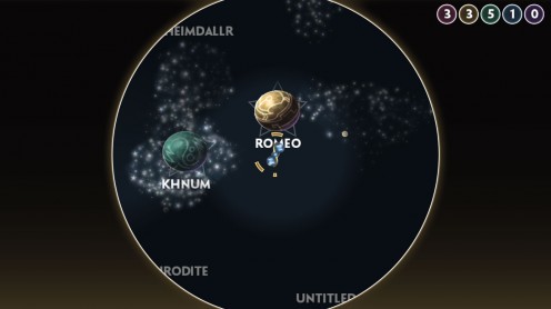
I’ve added a bit where things are only visible to the player if they’re close to the player, or if this new spinny radar thing of yours has recently swept over it.

This was a little difficult to pull off — it involves some custom shaders and pixel-by-pixel bitmap drawing, but I like the effect.

Right now, anything could be invisible if you’re too far away; that’s just for testing. Eventually, only objects marked as cloaked or hard to see will ever be invisible, and everything else will be visible at all times.

There’s a little bit of weirdness in the planet labels; apparently, Unity doesn’t let you use custom shaders with those. Like, at all. I was worried about that at first, but that shouldn’t be too much of an issue, since planets should never be cloaked.

Also, I’m not sure how I feel about the communication to the player about where the sensor is sweeping. Right now, there’s just a slight bit of darkness in the places you can’t see, and I like how unintrusive that looks… but it might be a little too unintrusive. I dunno.

Anyway, next I’ll be working on your item list, which will mean putting lots more work into my home-grown GUI system.

Broken Illustration

I think I figured out a big part of my problem with my Scopa workflow, and working in Illustrator in general: I think of things too much in terms of overlapping shapes.

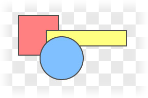
A lot of the time you can just draw a bunch of shapes, each one on top of the last, and be ok.

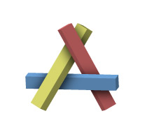
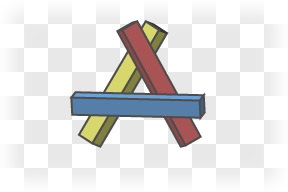
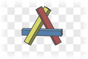
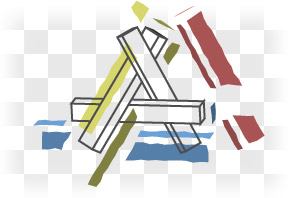
Everything’s nice and layered here. But say I wanted to make something with odd overlapping, like this:

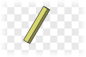
I could start with the yellow stick

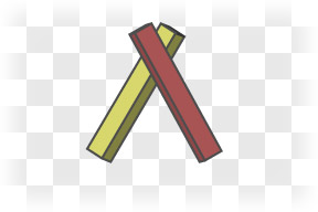
Add the red stick on top of that

Add the blue stick…

…and this is where things get a bit janky. The blue stick should go under the yellow stick, but over the red stick. There’s no order I can drop these things onto my drawing and get it to work.

The thing is, within Illustrator, I should stop thinking of these as sticks. I’m not working in three dimensions anymore; I’m working in two. I need to flatten everything out in my head, and see everything as flat shapes on a piece of paper.

If one three dimensional object overlaps another, that doesn’t always mean I get to make two 2-dimensional objects in Illustrator that overlap. Sometimes, it means that the top object breaks the bottom object.

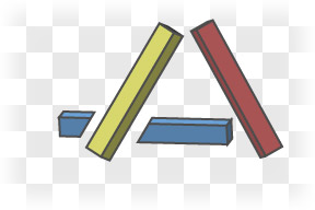
What I could do here is draw the blue stick as a couple of separate pieces. When they’re aligned right, you won’t be able to tell that’s what I’ve done.

But there are still overlapping objects here. It’s not a big issue with this simple a drawing, but for more complicated drawings, having too many overlapping objects can be kind of a pain. Selecting things becomes a bit counter-intuitive; I could click on a spot well inside the red stick and get the yellow stick instead because it’s right there under my cursor… just hidden. I do this all the time, and it’s immensely frustrating.

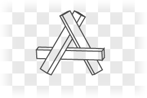
If I’m comfortable with my outlines — and I’d better be, before I move from paper to Illustrator — it might be best to just draw my outlines first

and add in colored, broken shapes everywhere, with nothing overlapping at all.

When I think of ‘layers’ in Illustrator, I think of my object. Like the layers of someone’s costume, layers of fabric.

But a good drawing has a different concept of layers. The drawing itself has layers that are completely unrelated to the layers the viewer might see in the thing being drawn. There are color layers and outline layers and shading layers, things like that.

I think I actually used something like this approach in my Girl Wonder thing, and didn’t quite realize just how good an idea that was until now.

Much Ado About Purple

So I made this game a little while ago called Green & Purple, for a game-making contest. You’re a green ball, trying to make contact with a purple ball, and live happily ever after together.
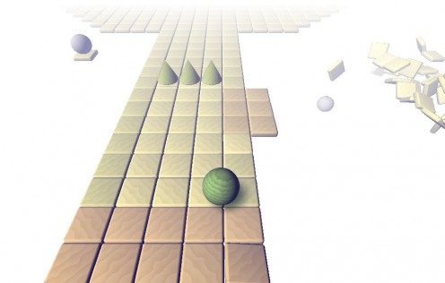
I actually spent a lot of time going back and forth on the colors. I wanted pastels; I wanted two colors that were contrasting, of course; I didn’t want your usual red vs. blue selection.

But most importantly, I didn’t want pink & blue. I didn’t want players to immediately see this boy/girl dichotomy there. Even in an abstract, hastily constructed game, I wanted to make sure I wasn’t reinforcing any of those save-the-princess type sentiments out there. It’s a pet cause of mine. So I went with green and a sort of bluish purple, which I figured were reasonably neutral colors.

Despite that, hearing people talk about the game, many referred to the purple ball as ‘she’ and the green one as ‘he’.

Trouble is, you’ve only got so many options. With sufficiently contrasty colors, one color is probably going to be warm — fiery reds and yellows — and the other bluer, cooler. In the absence of any other context, I suspect people are going to see the warm color as more feminine.
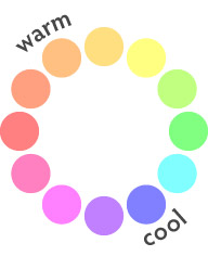
Near the end of the project, I worried that I was possibly falling into some gender stereotypes despite my best efforts to keep things neutral; the cool colored ball was the one you were controlling, the one with some agency; the warmer ball was completely passive, waiting to be rescued. I considered switching the colors, but didn’t have time to do it before the contest deadline came up.

But you know what? It wouldn’t have mattered. Because this is not about color choices or thinking that people who read too much into color choices are sexist. It’s about the biases we all carry.

Had I switched the colors, and had people read the purple player as female and the green object of its affection as male, you could say it was a gender-role reinforcing game design, to play a female character whose only goal is to find a mate.

Had I started with those colors — a purple player and a green companion — there’s a good chance I would have worried about that… and wanted to switch the colors.

Because I’m biased.

While I’d love the gender roles in the world to up and disappear, I certainly can’t say I believe they’ve already done so. I expect everything I see to express gender stereotypes; I expect to be annoyed by said stereotypes. Because I am biased, I will desperately try to pull my experiences in line with my expectations, spinning said experiences as needed. I will spin my perceptions of any game I play to fit in this world view, seeing sexism where there may be none — because thoughtless, sexist characterization is what I expect to see in most games.

And that applies to my perception of my own work. I will fight to keep my work egalitarian, but my biases will have me seeing depressingly overt sexism in everything I make. In a less abstract game, in a game with recognizable human characters, I will be wont to complain that I have failed to make such-and-such a female character sufficiently stereotype-breaking. I will graft a perception bias onto a character who may very well be, in an objective sense, portrayed in a perfectly respectful way. I will likely post a journal entry about it, wondering how I can do better. In my post, I will describe said character in terms of a stereotype that is an oversimplification of who the character actually is; and in doing so I will reinforce the very stereotypes I seek to avoid.

Fighting bias is a skill. Wanting to be less biased does not immediately grant you this skill. Wanting to produce works with an egalitarian world view does not immediately grant you this skill. I know I say that a lot, such-and-such-a-thing is a learnable skill, not a part of your core being. But having bias, being prejudiced or bigoted or whatever… it’s very, very tempting to think of acting upon bias as a failure of conscience, rather than a failure of skill.

I’m coming to the conclusion that it’s a lot more complicated than that.
Friction

The thing about my whole ‘throw things at the wall and see what sticks’ approach to improving my productivity is, you have to take time to see what’s sticking and what’s not. And I think I’ve just realized something here isn’t as sticky as I thought.

* * *

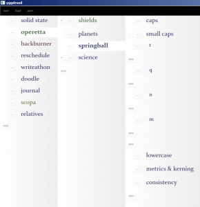
My pet project management thingie has, just within the last week or so, gotten into a mostly usable state. It still needs a lot of work, but I can reliably use it to manage my projects.

It’s basically just a tree. You can add things to the tree, change the order of things, move things up or down in the tree, and select whether individual nodes will open in a new pane or just expand like, you know, a regular tree control.

I was keeping all this information in a simple text file, but a couple months ago I decided it would be a good idea to ditch the text file and start using my still-buggy homemade software. I figured if I forced myself to use it, I would then be more motivated to fix the bugs.

I was wrong.

Instead of using my software and trying to fix it, I just abandoned project management entirely. And there was a massive hit to my productivity because of that.

It’s a little too easy to abandon my pet projects, even though I know that doing so is bad for my mental health. You can have all the motivation in the world, but sometimes it’s not about motivation. For something like this, sometimes you have to look at the other end of things and reduce the friction that’s stopping you from moving.

So I dropped everything and got this app usable, and that’s a big part of why I’m now getting everything back on track.

* * *

My Adobe Creative Suite software — Photoshop, Illustrator, Flash; that sort of stuff — is a couple versions and a few years out of date.

Adobe has moved to a subscription based service for their software, and I’m finding it hard to justify the cost, given that I don’t do any freelancing anymore. In fact, it’s entirely possible that I will never get a new version of Photoshop the same way I will never buy a new desktop computer. It just doesn’t seem to make sense anymore.

* * *

I’d like to get moving on that comic with Marie, and haven’t decided yet if I’m going to do it in Illustrator or my own custom paint program that I write a while ago, just for this sort of thing.

Illustrator is a known quantity, but it has trouble with files with lots of filters, which I use extensively. Getting a new computer won’t help; the problem is that, because it’s old software, it can’t take advantage of all the memory present in new machines.

On the other hand, my custom paint thing has some potential, but is also very buggy and needs to be updated quite a bit before I’d really say it’s usable.

I’d say I should just go ahead and declare that I’m going to use my own program and that will motivate me to clean it up… but I’m coming to the conclusion that that strategy is never going to work. Which is not to say I’ll never get the paint program usable. I think I just have to do it for its own sake.

I can’t think of it as a quick fix for the hole left by an outdated Creative Suite; it will never get done that way… I have to think of it as worth the investment instead.

Play Ball

Got some good work done over the three day weekend. Not as much as I’d like to have gotten done of course, but still, I feel like I’ve gotten things back on track. Even did an elliptical workout.

Have a pretty picture:

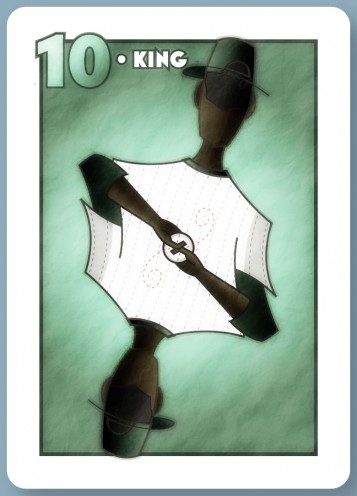
So here’s a nearly complete version of that baseball player I mentioned the other day. It’s feeling a little flat to me; I might need a number on the player’s jersey to add interest and provide a background for the ball, which is getting kinda lost now.

I think it sorta looks like he’s passing the ball to himself, rather than preparing to pitch it, but I’m mostly ok with that. Some weirdness is to be expected here, and I’d even go so far as to say that’s going to be part of the appeal of this style. As my first character with limbs, this is the first time I’m actually seeing that weirdness that comes with your typical playing card characters.

Copyright © 2017 Brian Crick.